A simple Sankey chart
Learn how to create a simple Sankey chart using DataPicta.
This tutorial provides a step-by-step guide for creating a Sankey Chart to analyze visitor flow in a Zoo.
Go to app.datapicta.com to open the DataPicta application.
1. Open DataPicta Application
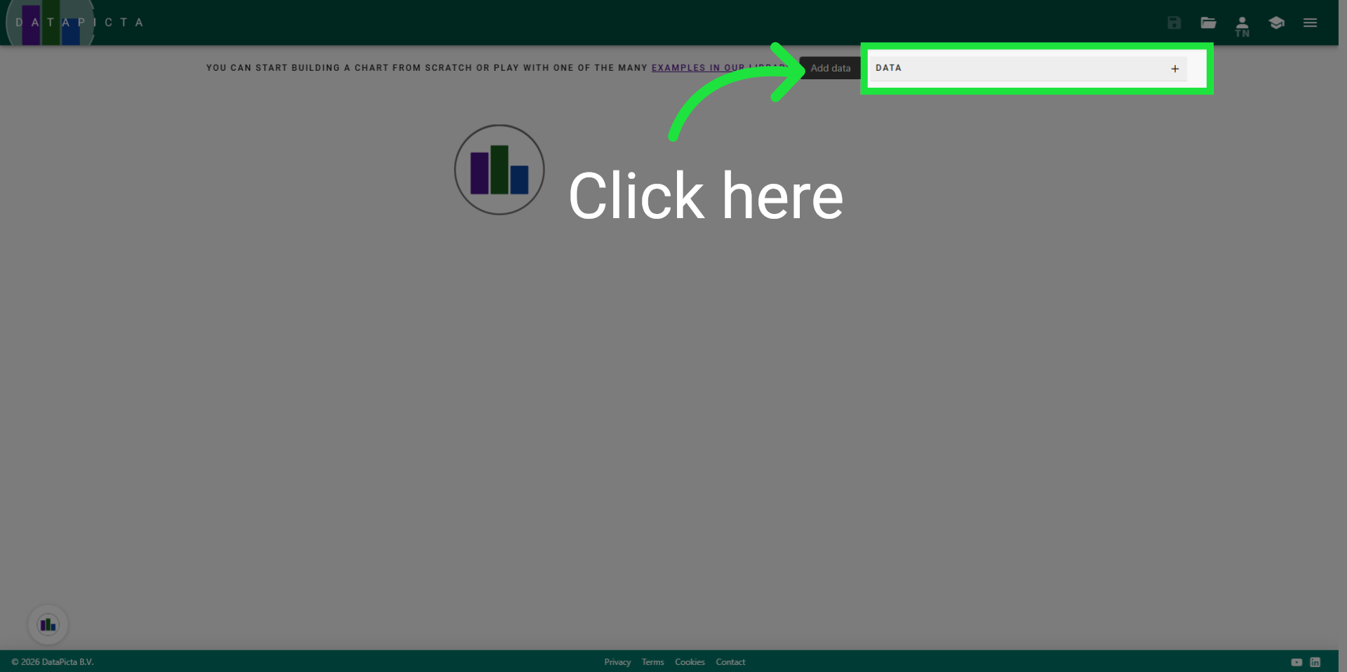
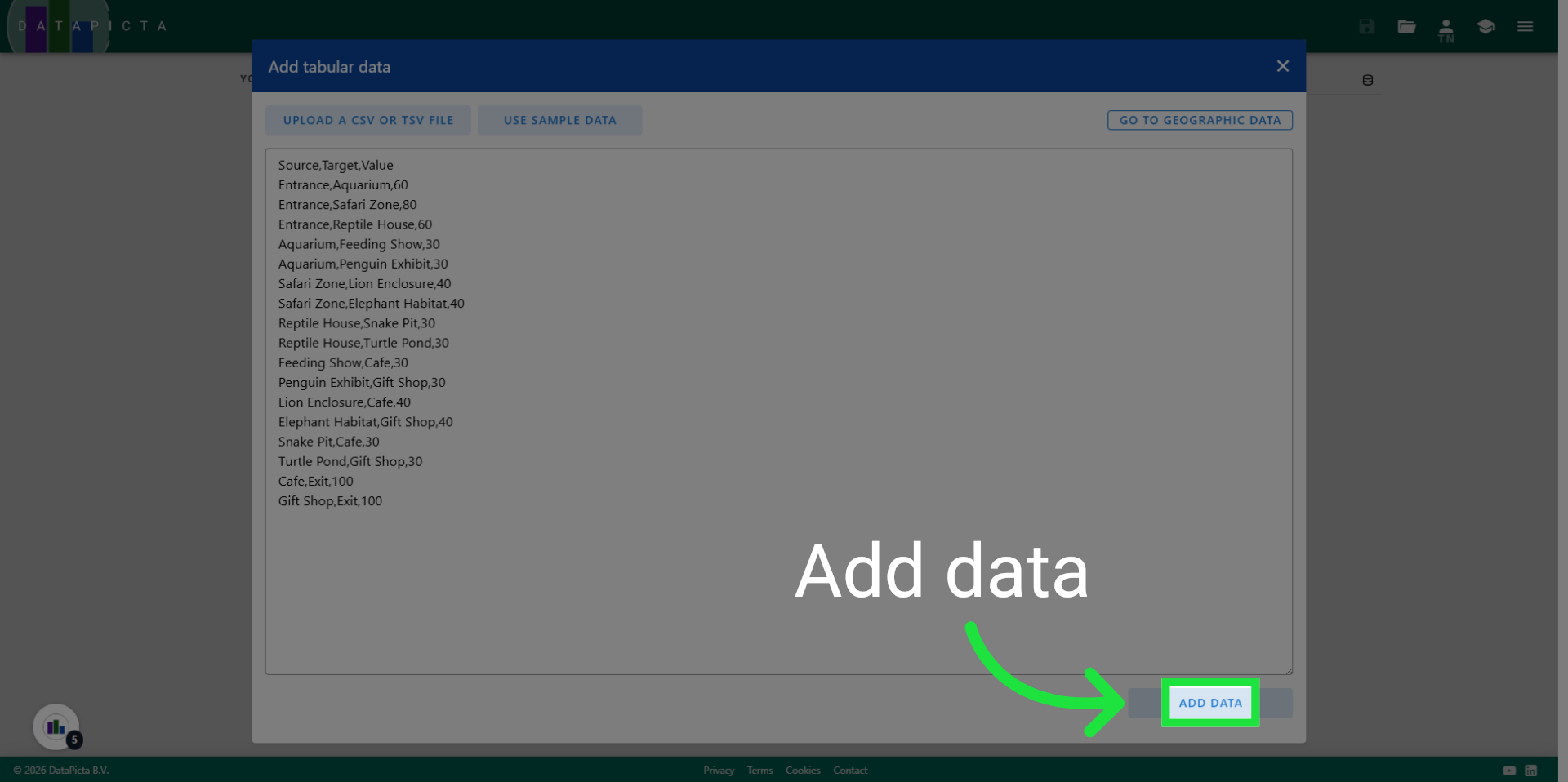
We start with an empty project in the datapicta application. If you used DataPicta before, you can delete any chart by clicking the hamburger menu and choose "new blank chart". After that you can start adding data by clicking "Add Data"
2. Load Sample Data Set
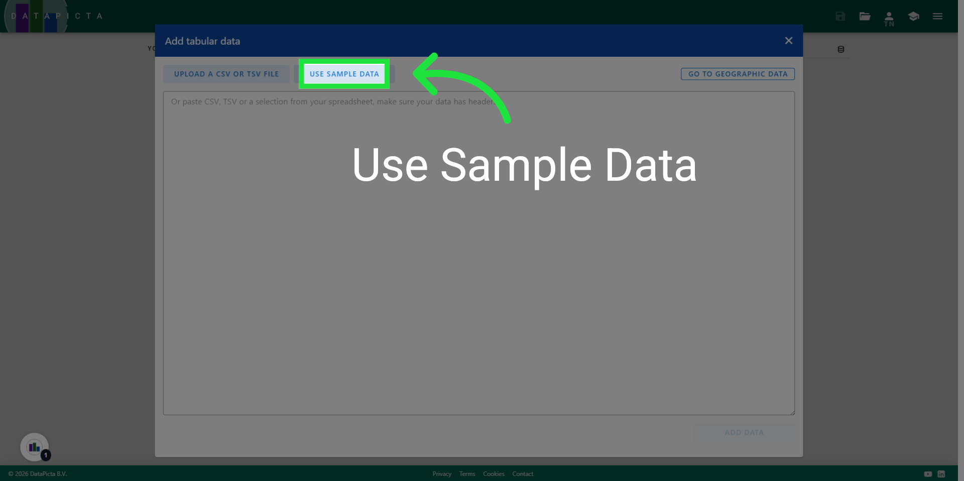
Click "Use Sample Data" to load a predefined dataset.
3. Access Search Names Feature
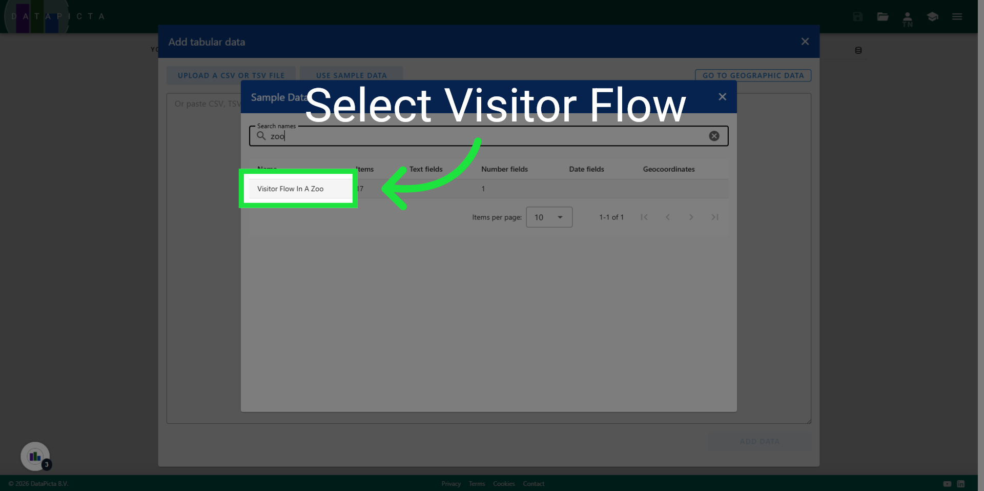
Enter "zoo" in the search field to filter the displayed datasets.

4. Select Visitor Flow Report
Click "Visitor Flow In A Zoo" to choose the specific dataset.
5. Add Data
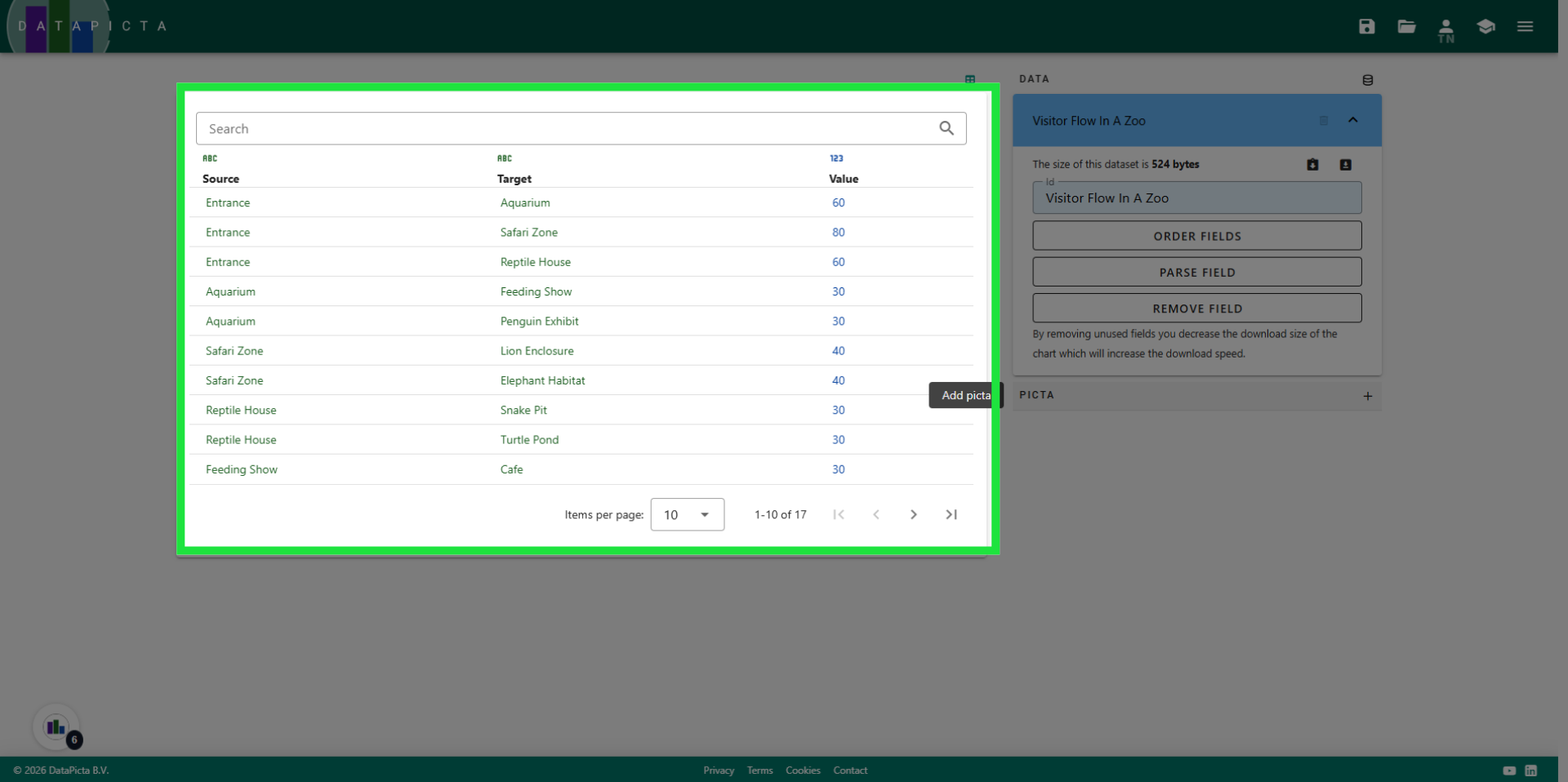
Click "Add data" to import this data into the chart.
6. Proceed to Next Step
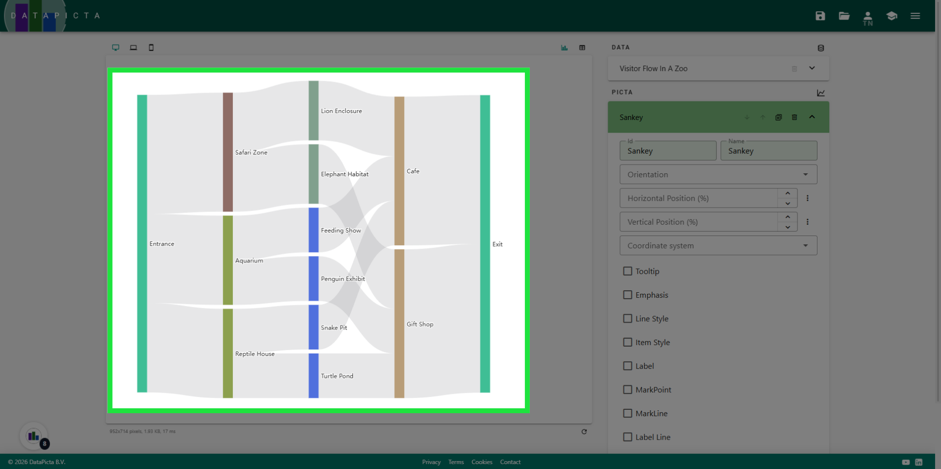
Let's pause for a moment and take a closer look at the data. The dataset consists of three columns: two containing text and one containing a number. This structure is precisely what is required for a Sankey Chart. Please note that visitors enter the zoo through the entrance and leave through the exit. However, once inside the zoo, they can move freely. This is why 'Entrance' appears only in the first column and 'Exit' only in the second column, while all other names are present in the first and second column. The value column indicates the number of visitors moving from the source to the target.
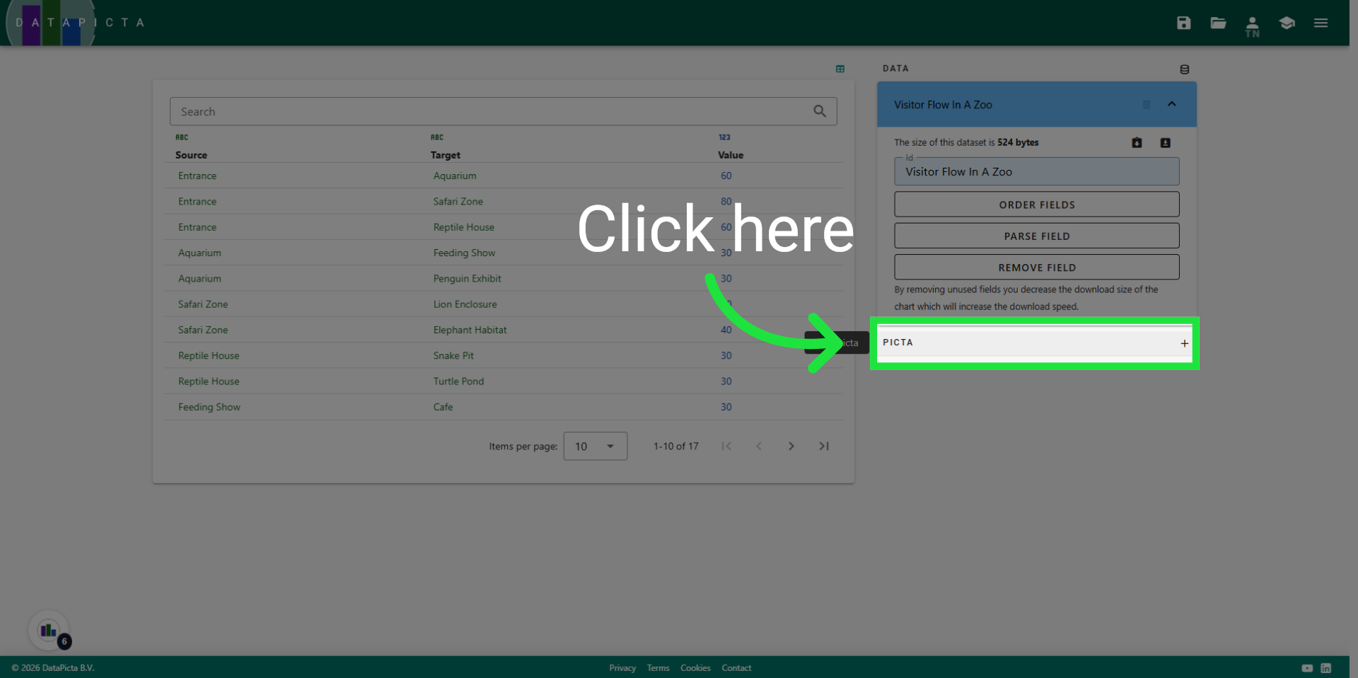
7. Add a Picta
Click here to open the Picta dialog.
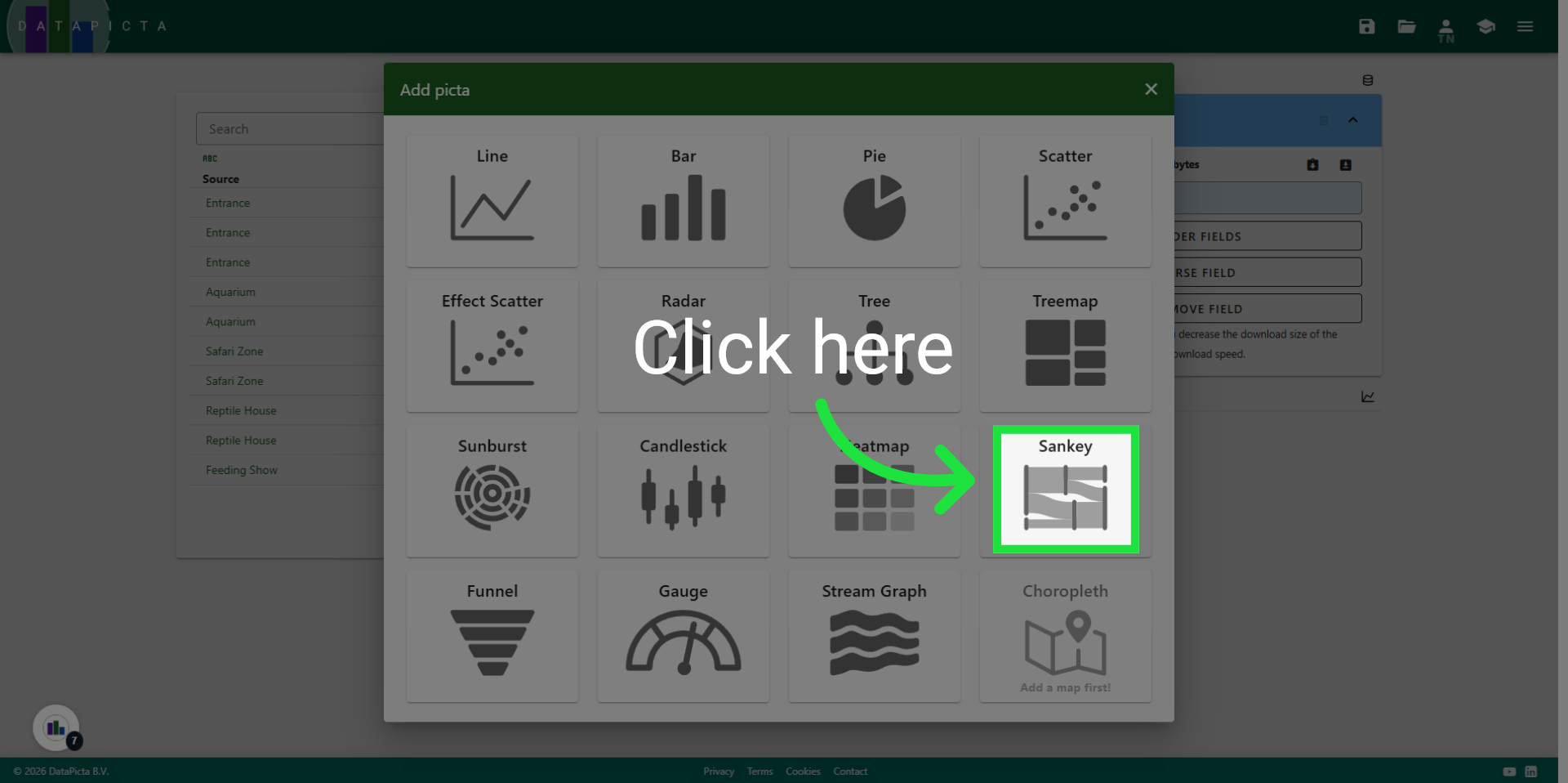
8. Advance Configuration
Choose the Sankey Picta.
9. Finalize Setup
And that's it! You have created a Sankey chart that illustrates the flow of visitors in a zoo. The key point to remember is that a Sankey chart requires its data to be in a specific structure.