A simple pie chart
Learn how to create a simple pie chart using DataPicta.
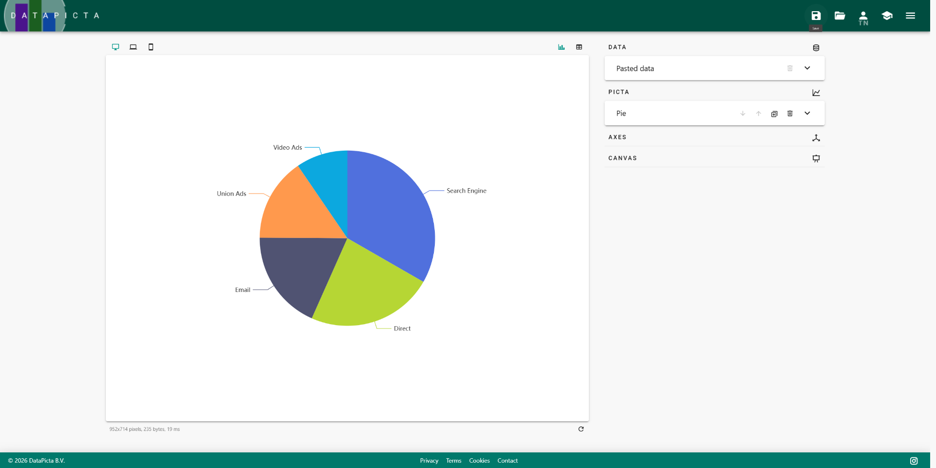
In this tutorial, you'll learn how to create a simple pie chart using DataPicta with sample website traffic data. It shows the distribution of traffic sources to a website.
Go to app.datapicta.com to open the DataPicta application.
1. Introduction (2)
You will learn how to input your data and visualize it effectively.
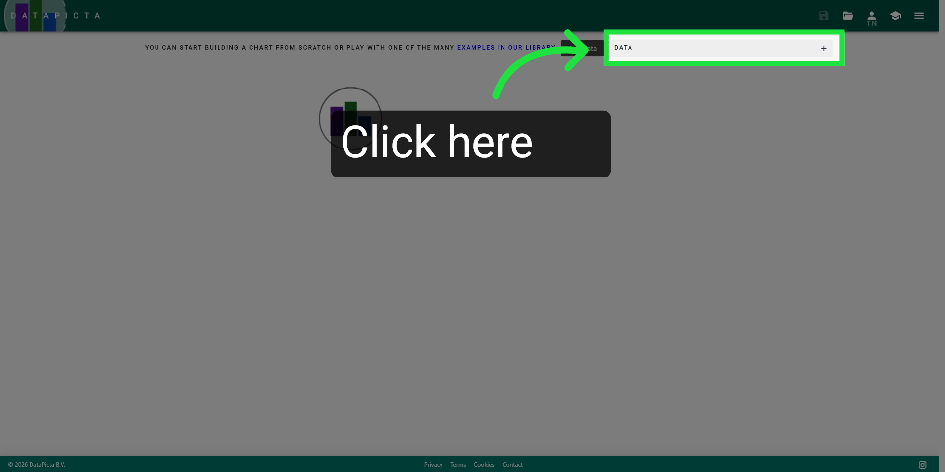
2. Open Data Input Options
Click here to open the data input options in the DataPicta app.
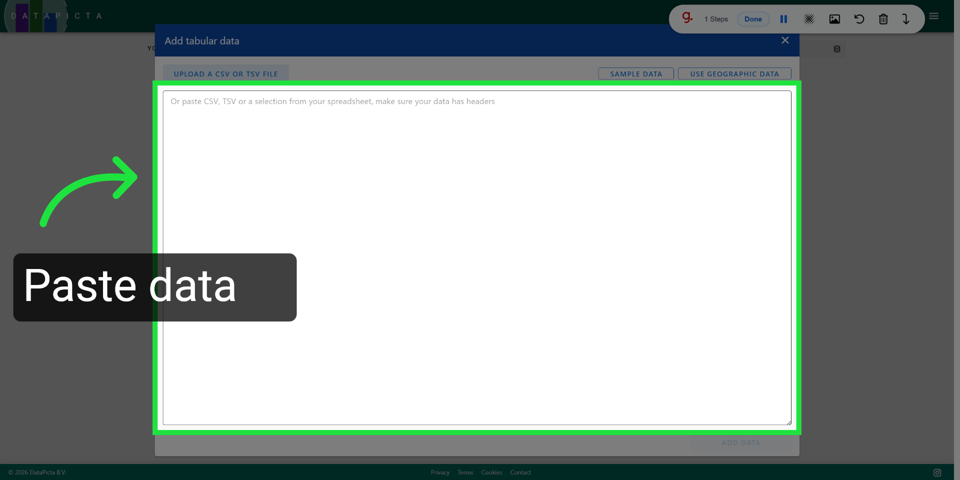
3. Access Data Paste Interface
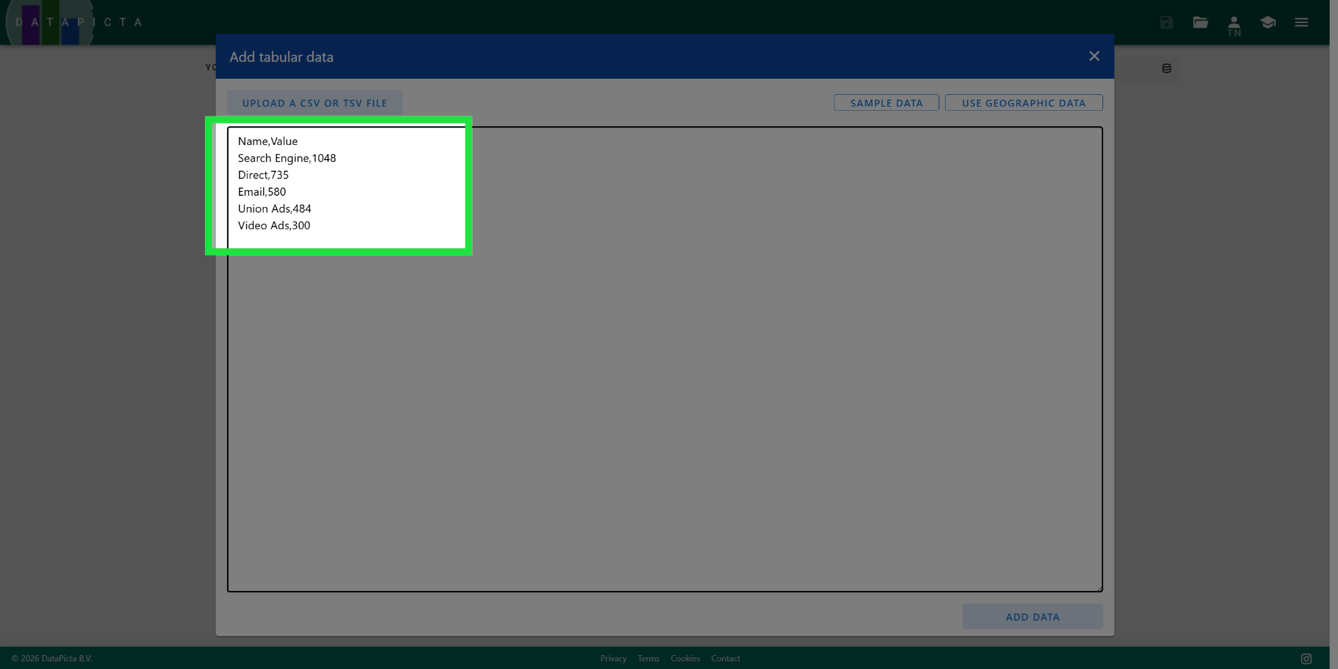
Copy and paste the following data into the input field. This data represents the traffic sources for a website.
Name,Value
Search Engine,1048
Direct,735
Email,580
Union Ads,484
Video Ads,300
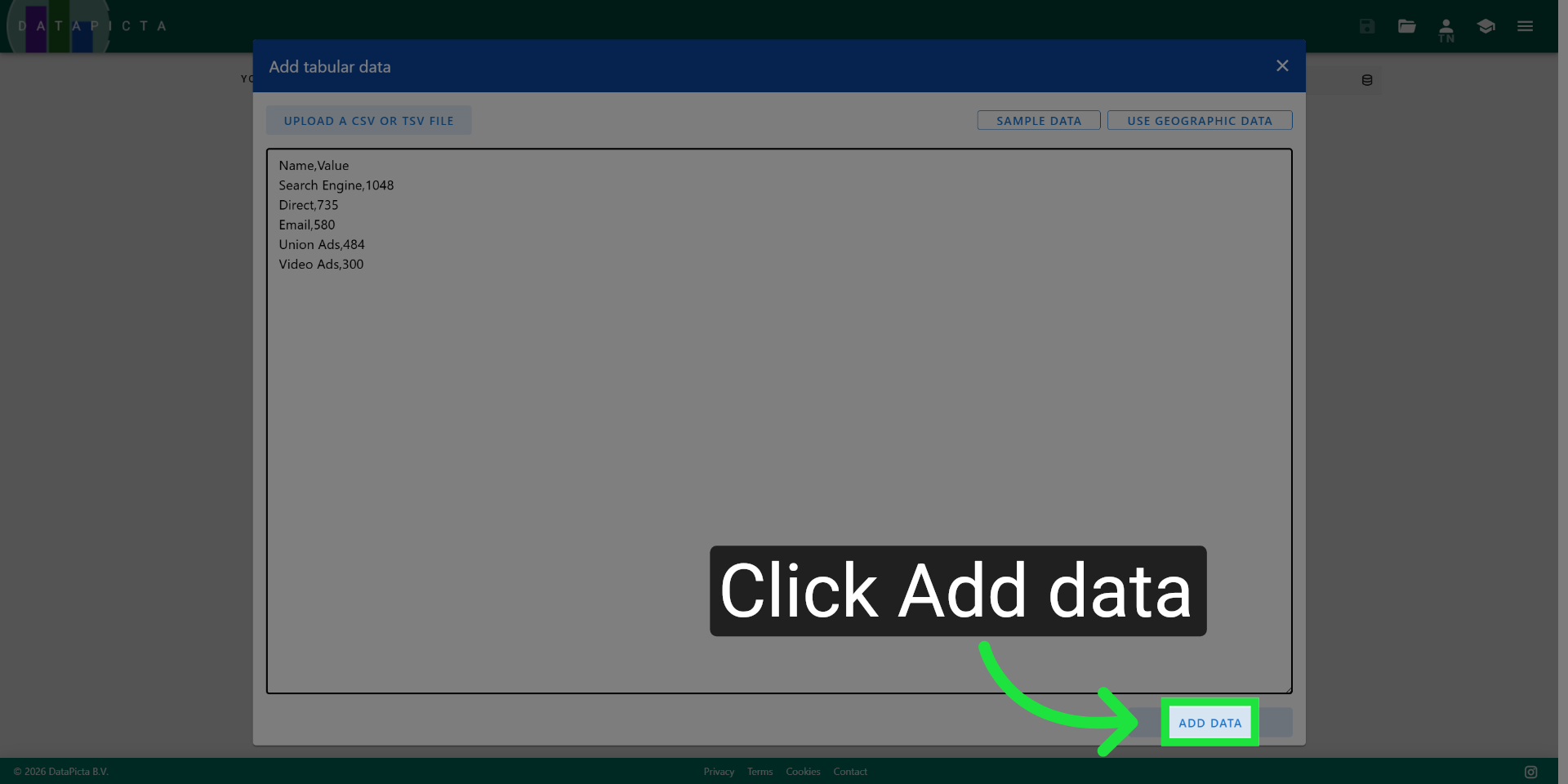
4. Add Data To Chart
This data represents the traffic sources for a website.
5. Add Data To Chart
Click "Add data" to include your entered information into the chart.
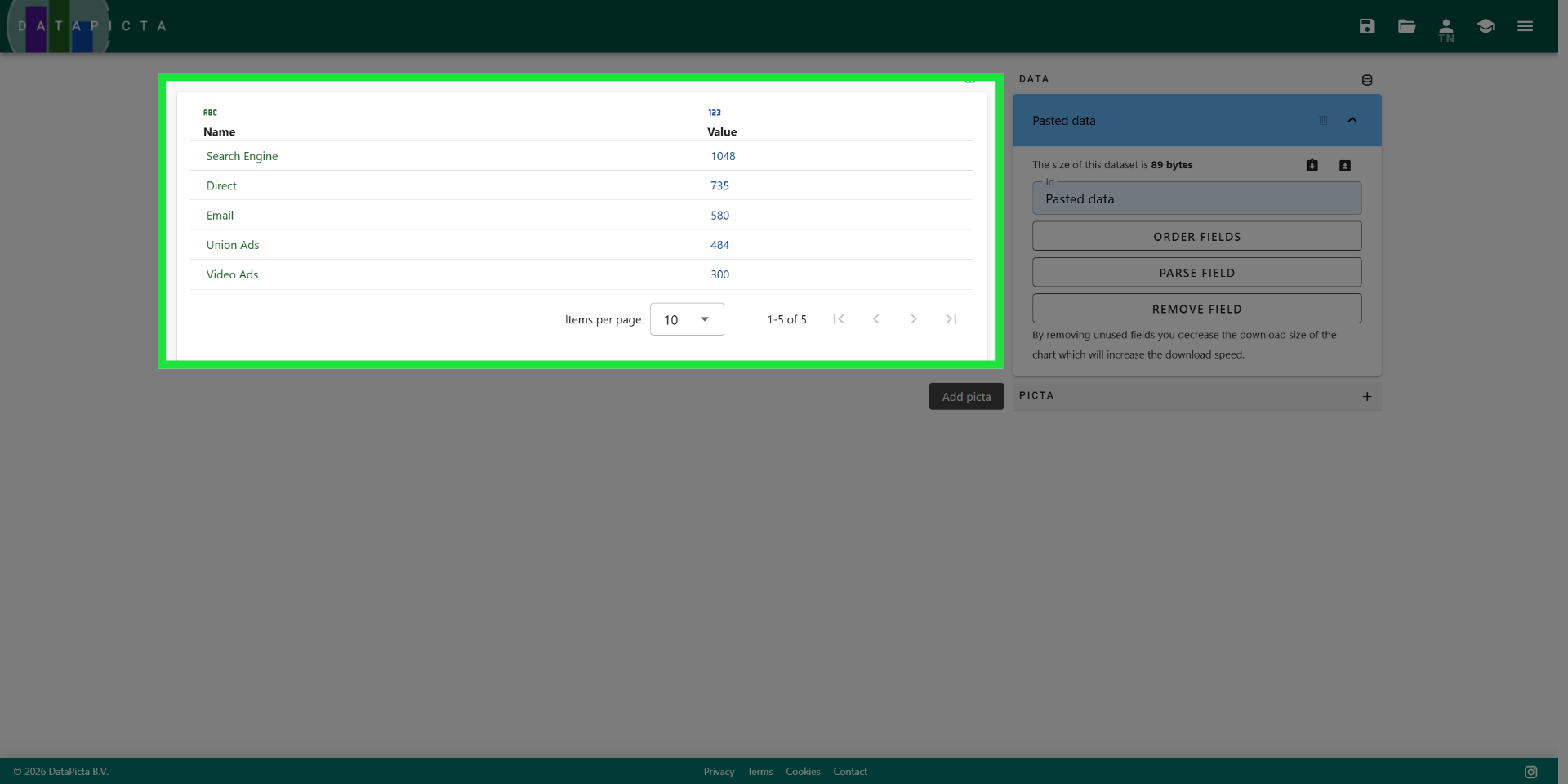
6. Select Chart Type
Your data is now displayed in a table; you can customize it as needed.
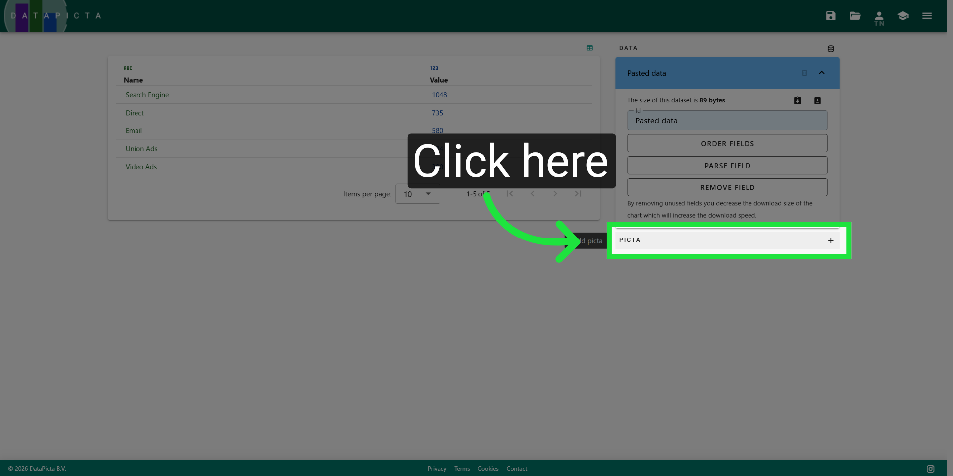
7. Select Chart Type
Click here to choose the type of chart you want to create.
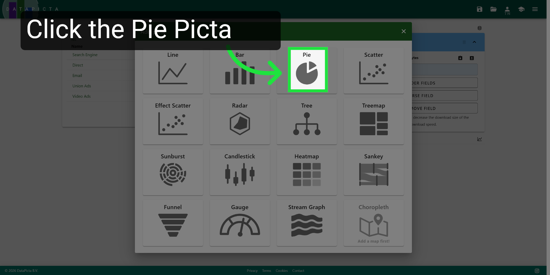
8. Choose Pie Chart Option
Click here to select the picta you want for visualization your data.
9. View Completed Chart
You have successfully created a simple pie chart. From this point, you can customize, save, and publish your chart.