A smooth line chart
Learn how to create a line with a smooth curve using DataPicta.
In this tutorial, we will create a line chart. Line charts are commonly used with a timeline. We will smooth the line, add a title, and enable tooltips when hovering over the chart.
Go to app.datapicta.com
1. Introduction
For this chart, we will utilize a sample data set.
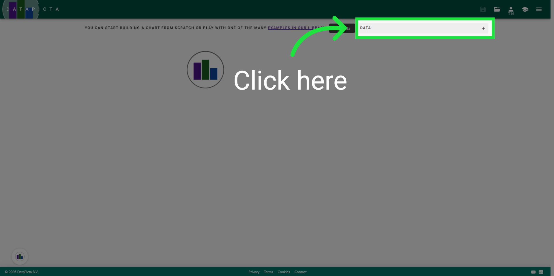
2. Open "Add Data"
Click here to open the 'add data' dialog.
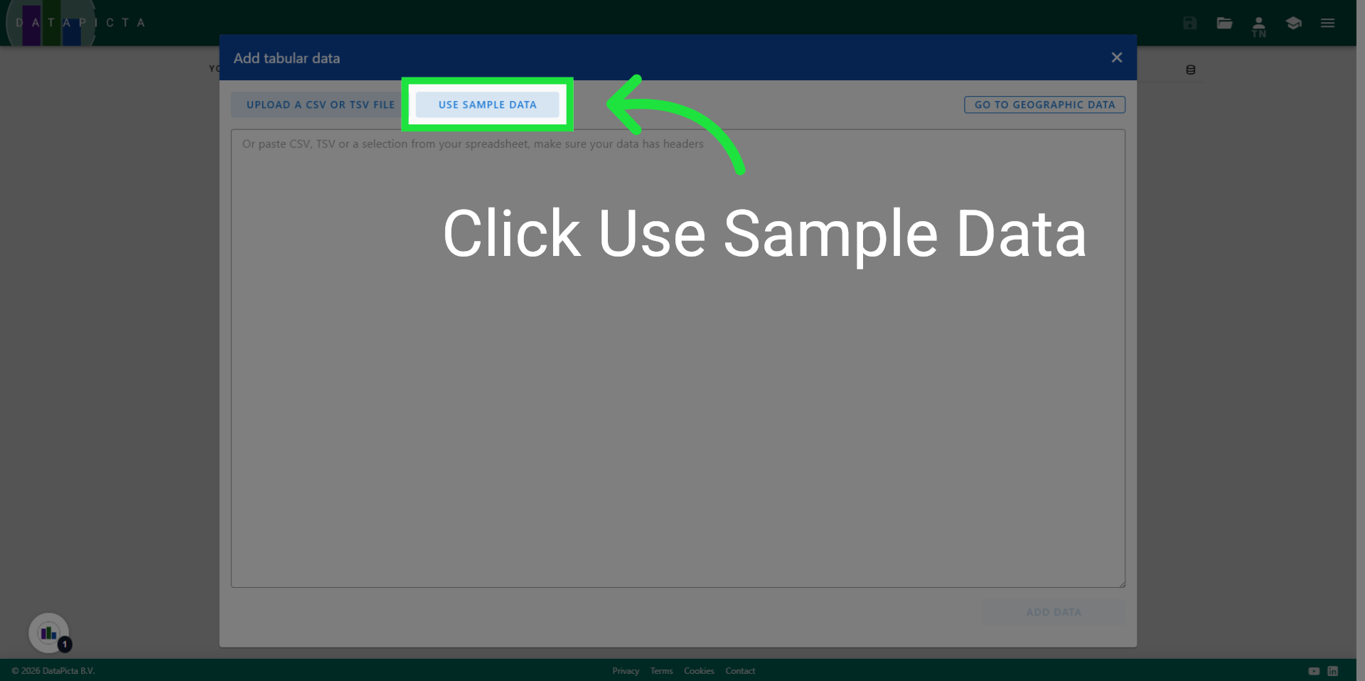
3. Load Sample Data
In this dialog, you can paste or upload data, or select from one of the many sample datasets. Click 'Use Sample Data'.
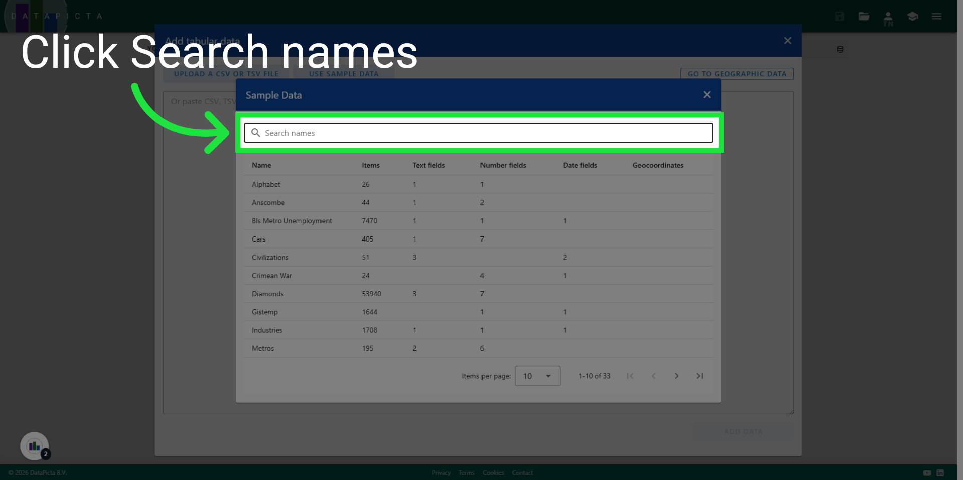
4. Click Search Names
Click "Search names" to begin filtering datasets by name.
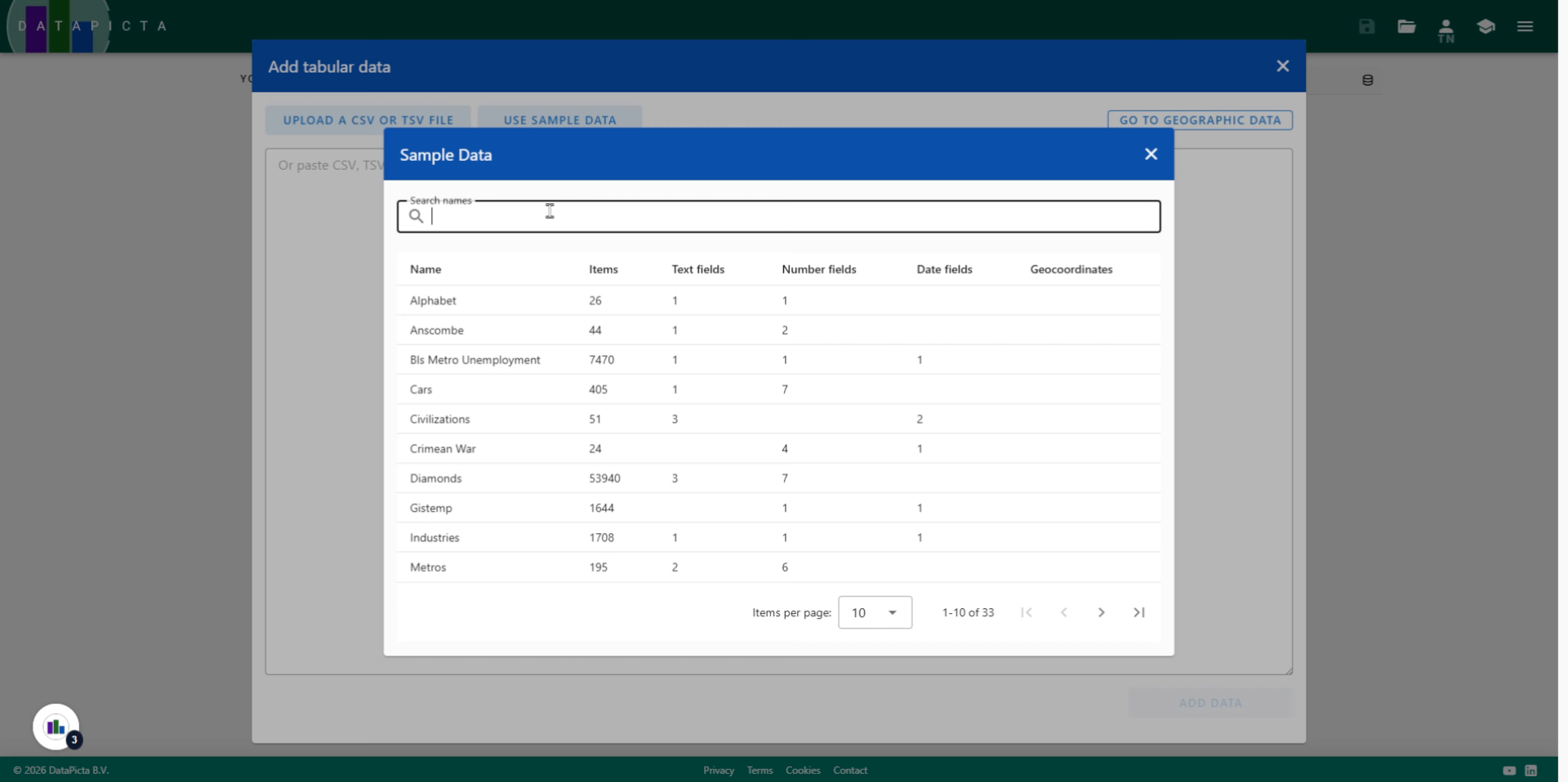
5. Enter Search Term
Type "weight" in the search field to find the 'Weight over Time' dataset.
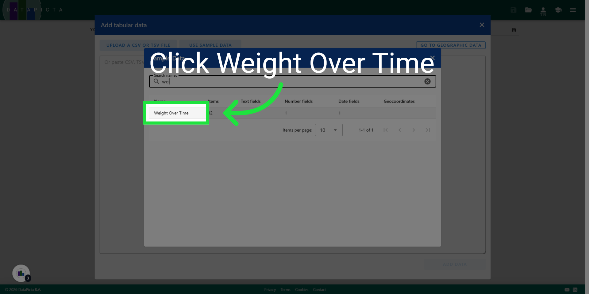
6. Select "Weight Over Time"
Click "Weight Over Time" to choose this dataset.
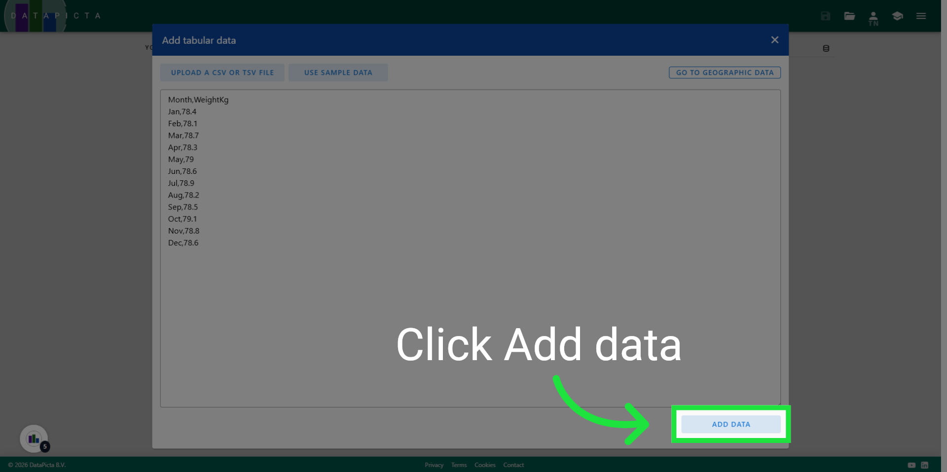
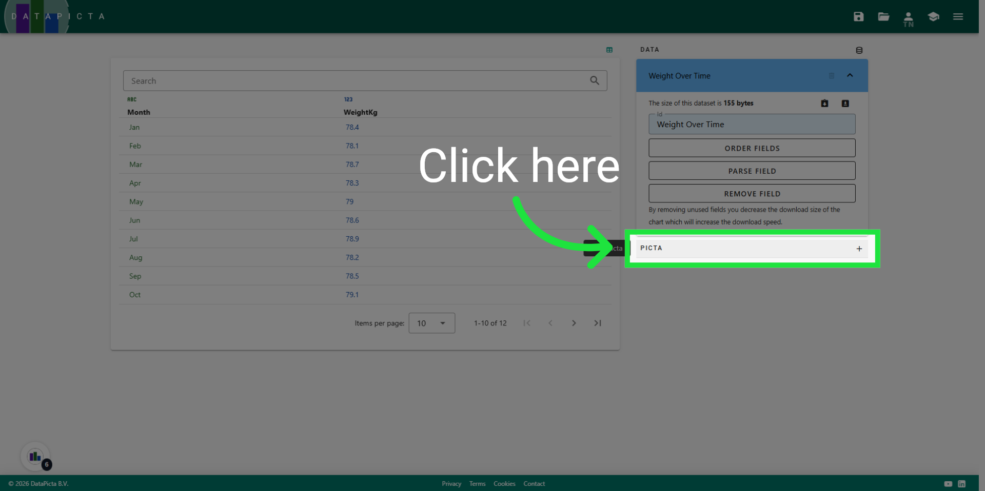
7. Add New Data
This dataset provides a straightforward overview of an individual's weight recorded monthly over the course of a year. Click "Add data" to incorporate this information into the chart.
8. Click Picta
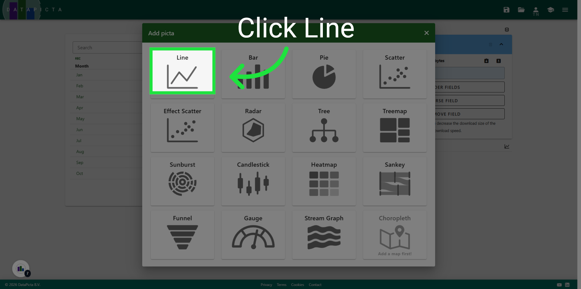
A line chart is an excellent option for data that includes dates. Click 'add picta' to select a 'picta' for this chart.
9. Pick Line Picta
Choose the 'Line' picta.
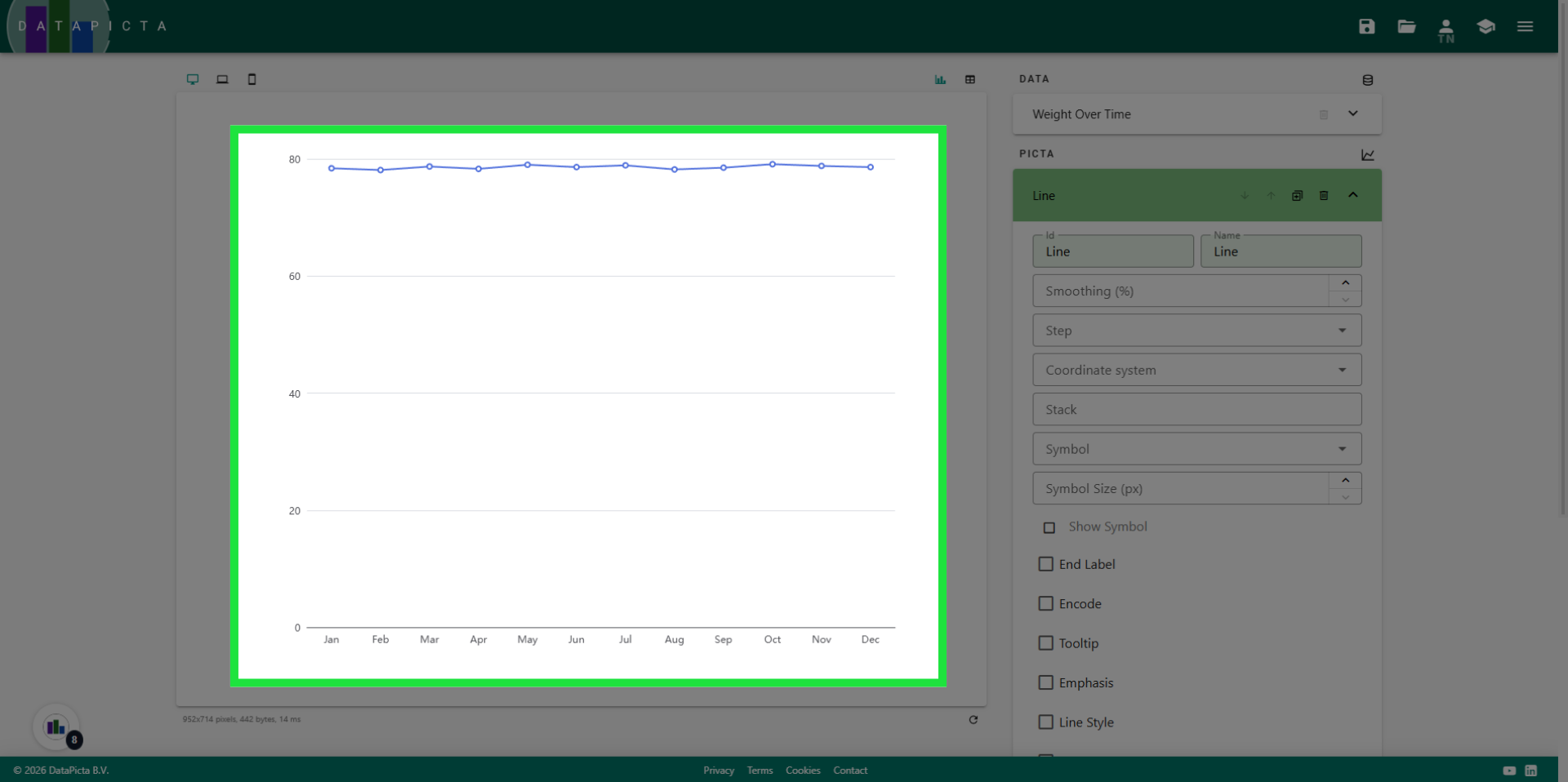
10. View Result
You have created a line chart, but there is potential for enhancement. Let's begin by removing the white space beneath the line.
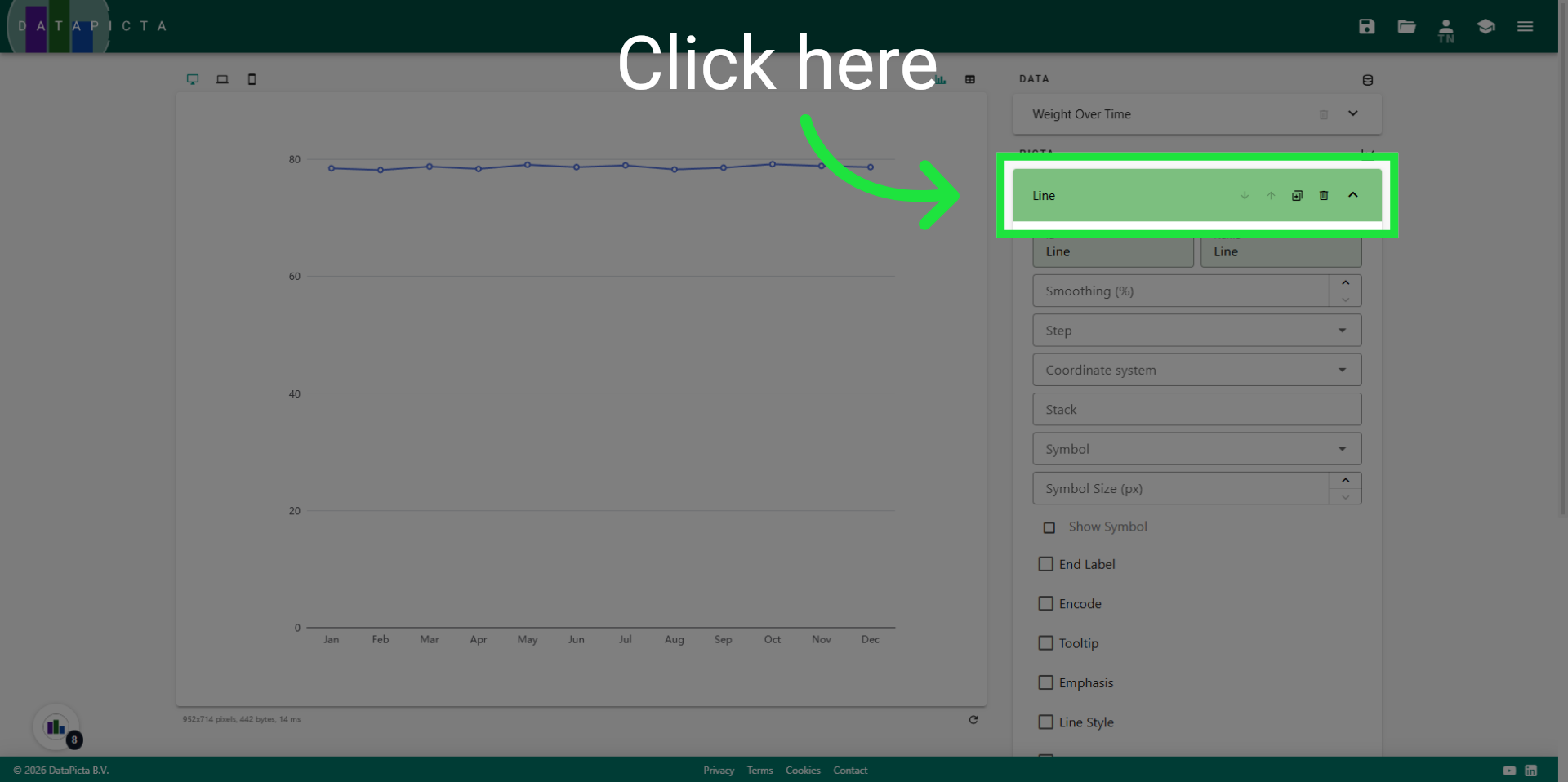
11. Close Line Panel
Close the panel for the Line picta.
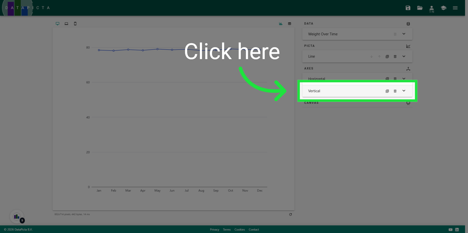
12. Open Vertical Panel
Panels for the horizontal and vertical axes were automatically added when you selected the line picta. We will now make an adjustment to the vertical axis. Please open that panel.
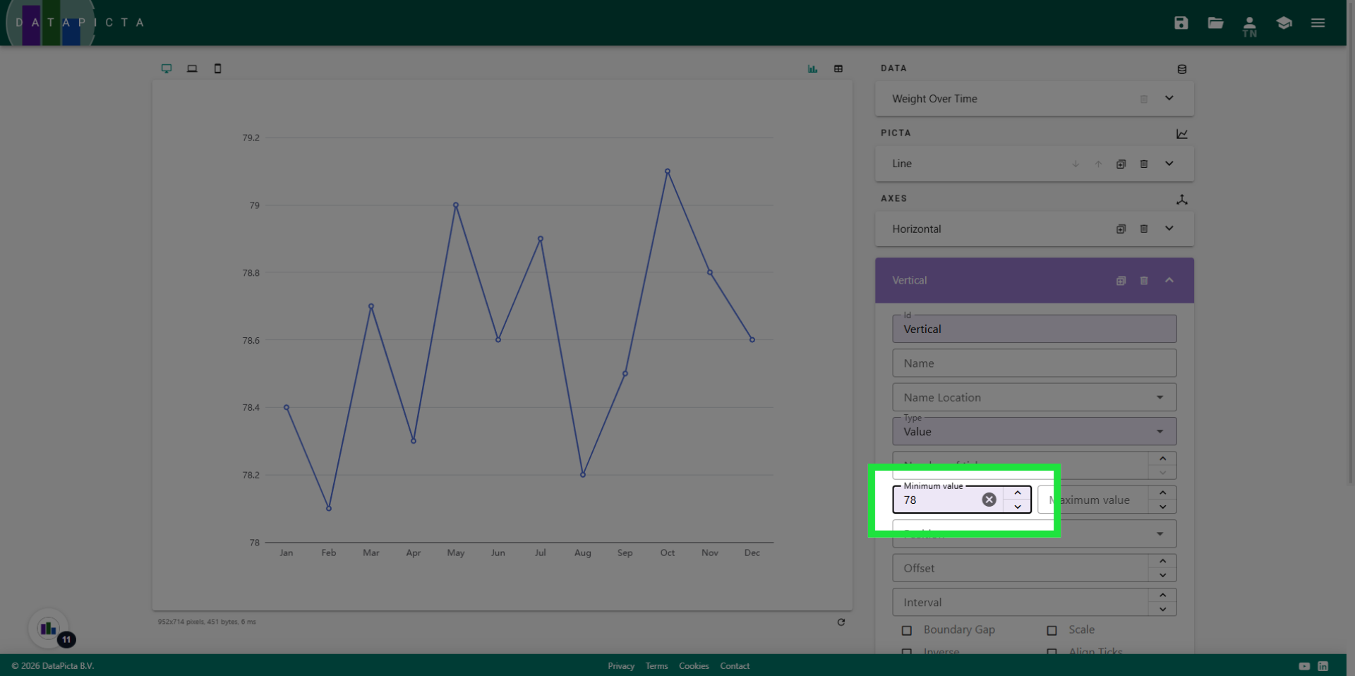
13. Open Value Settings
By default, an axis starts at zero. However, to eliminate the white space, we adjust that value to '78', which is just below the minimal weight of this person. Enter '78' for the minimal value.
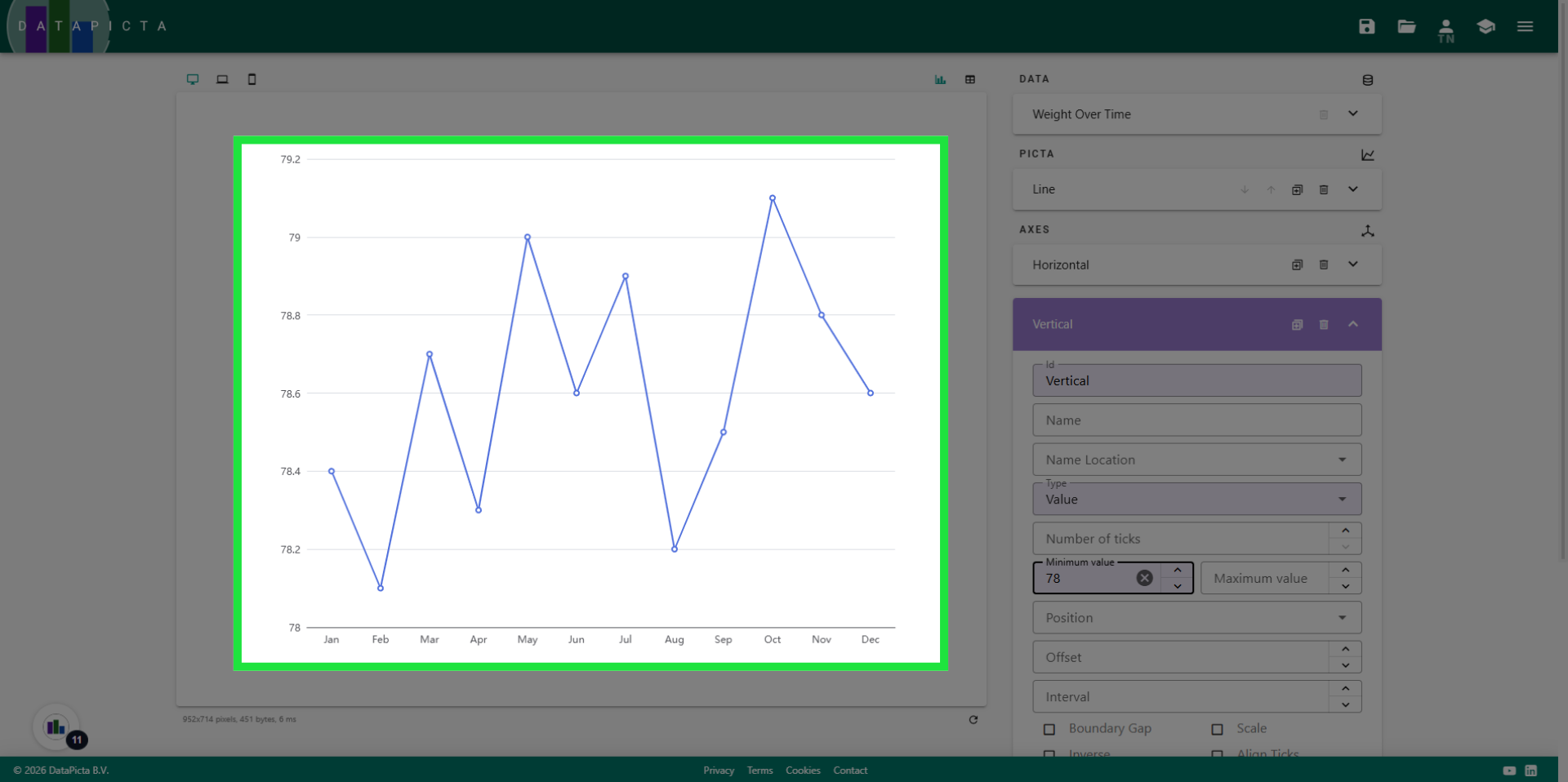
14. Change Minimal Value
The update is rendered immediately in the chart. Of course, gaining and losing weight does not exhibit these spikes, so let's smooth out this line.
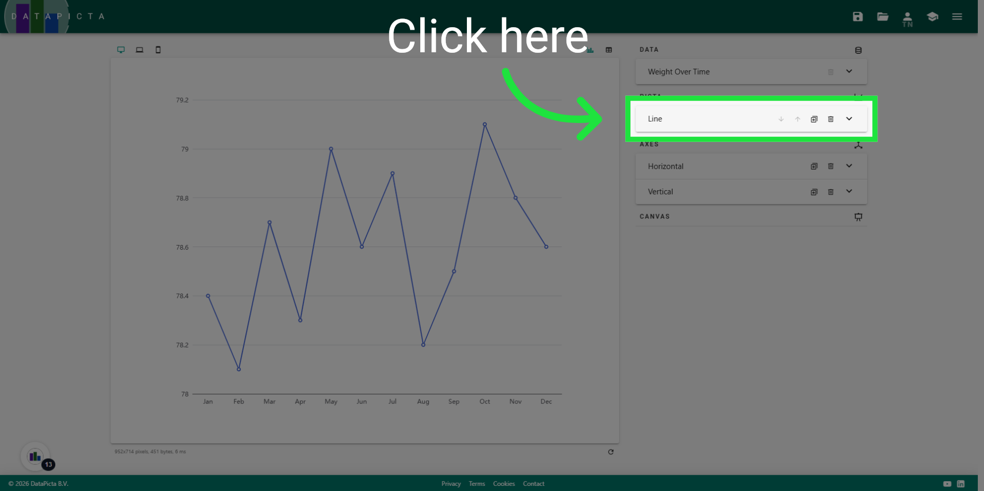
15. Open Line Panel
To make changes to the Line, we need to reopen the line panel.
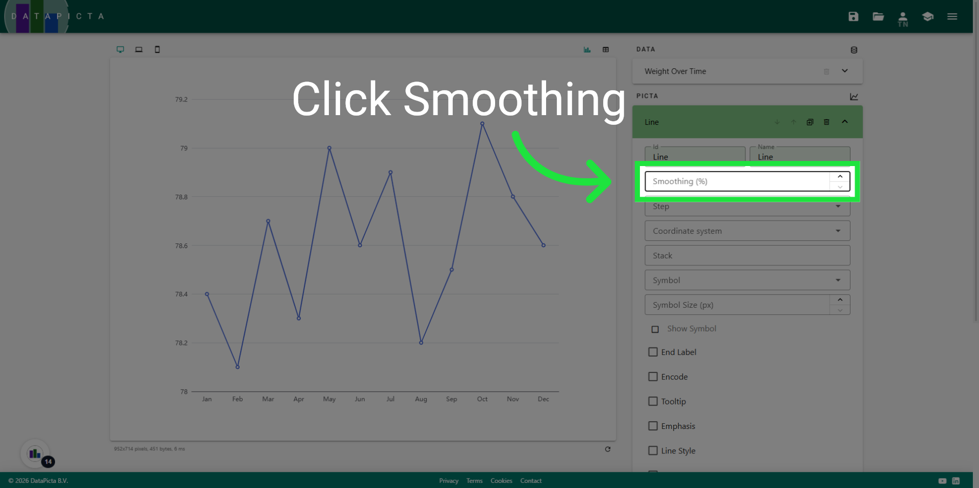
16. Select Smoothing
Click "Smoothing" to adjust the smoothing level of the chart.
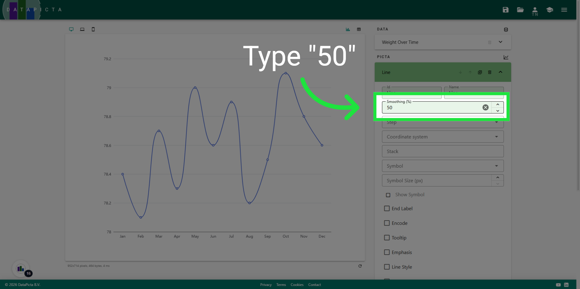
17. Set to 50
Fill "50" to set the smoothing percentage to 50%.
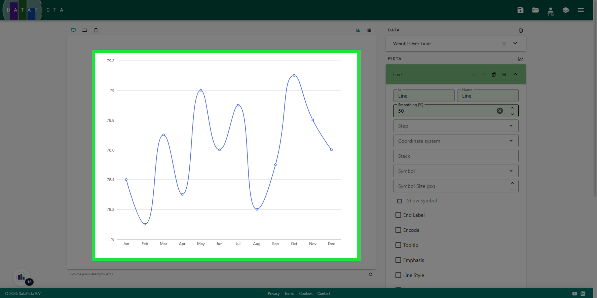
18. View Result
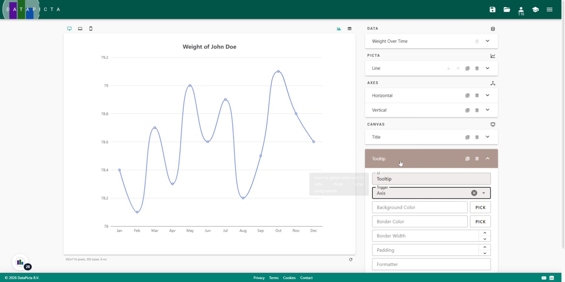
Enjoy the result. It looks significantly more realistic. To further improve the chart, we will add a title and a tooltip.
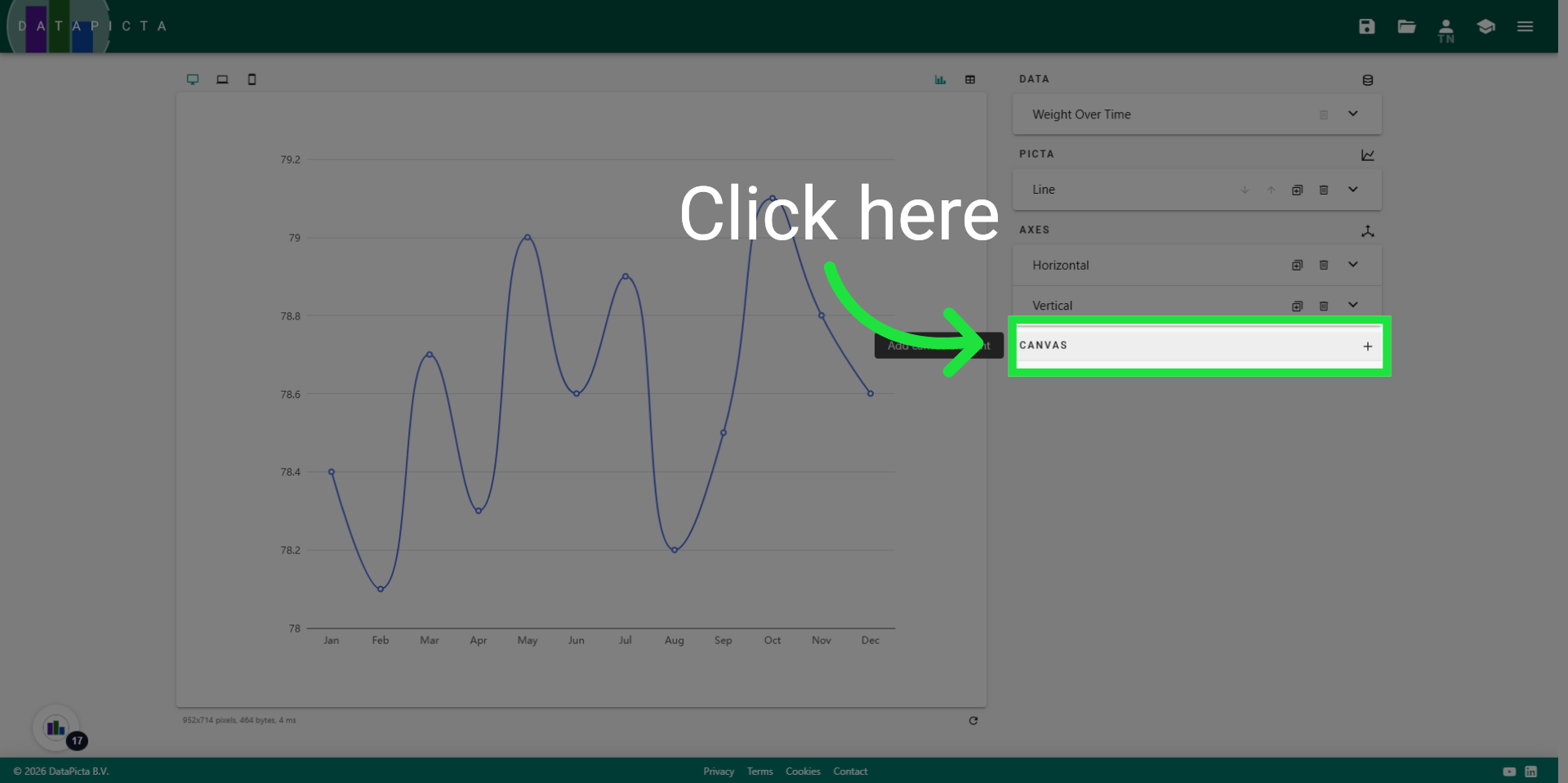
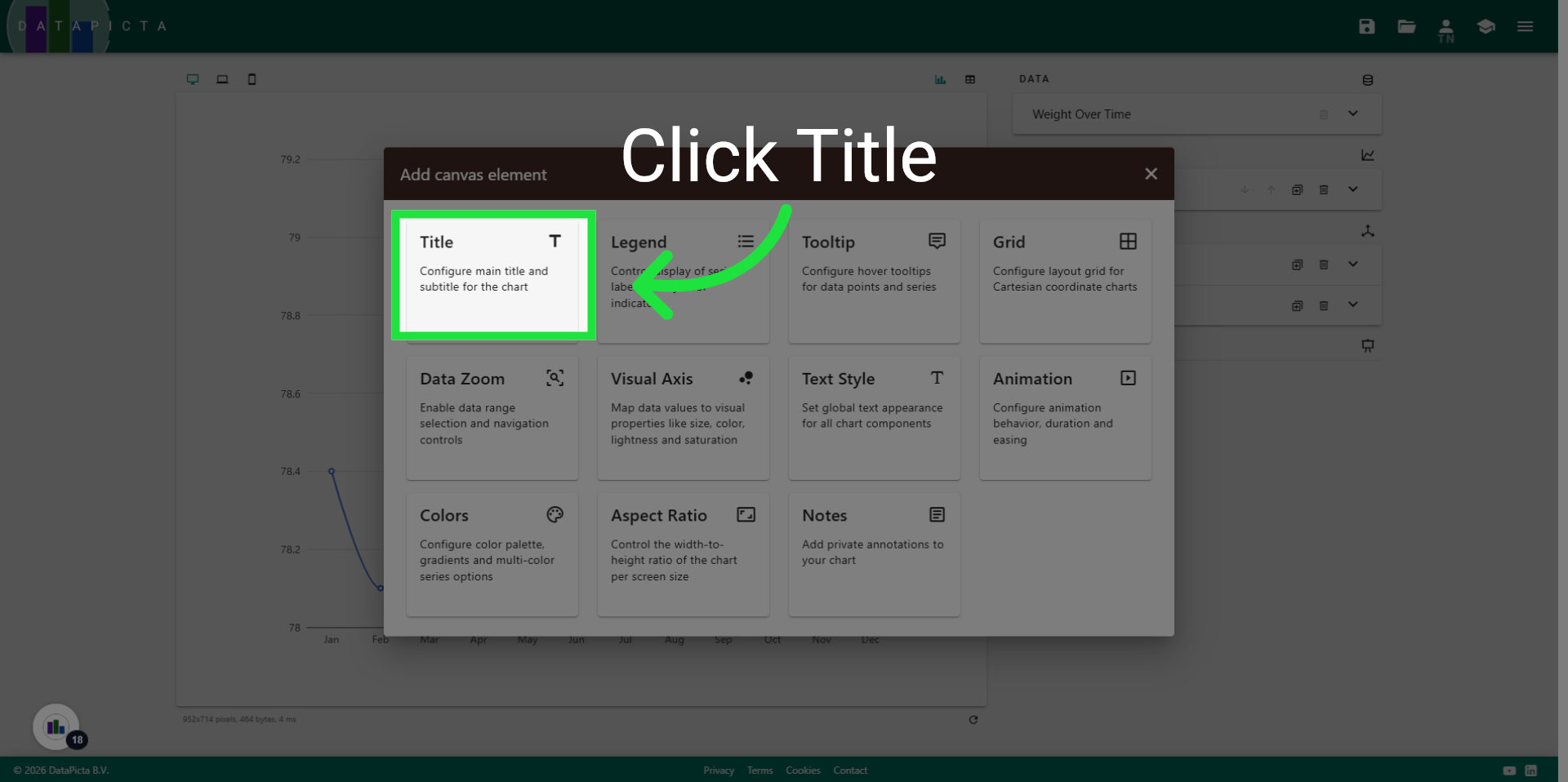
19. Add Canvas
A "Title" and a "Tooltip" are both elements of the Canvas. Click "Add Canvas" to open the canvas dialog.
20. Add Title
First add the Title element.
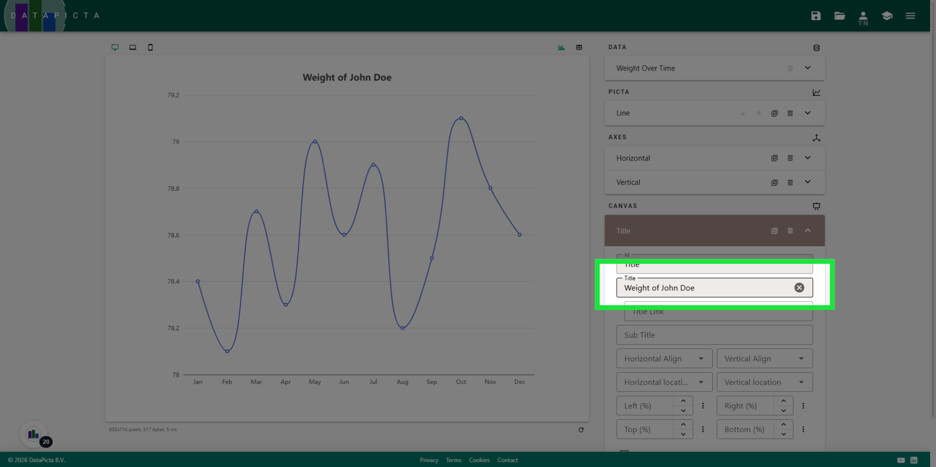
21. Set the Title
Please change the title to something more meaningful. For example, type "Weight of John Doe".
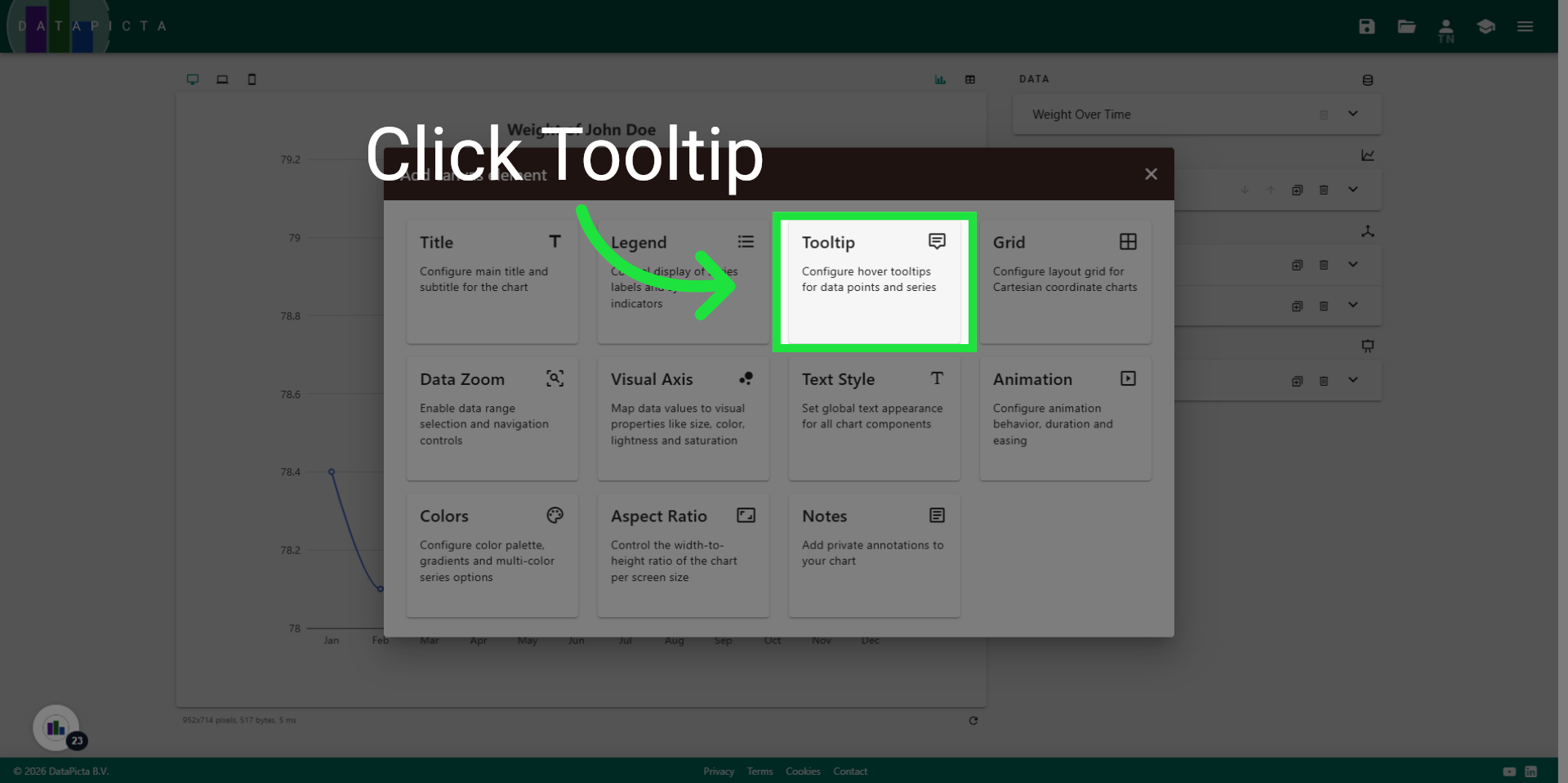
22. Add Canvas
Click on "Add Canvas" again.

23. Add Tooltip
Click "Tooltip" to add the tooltip element to the chart.
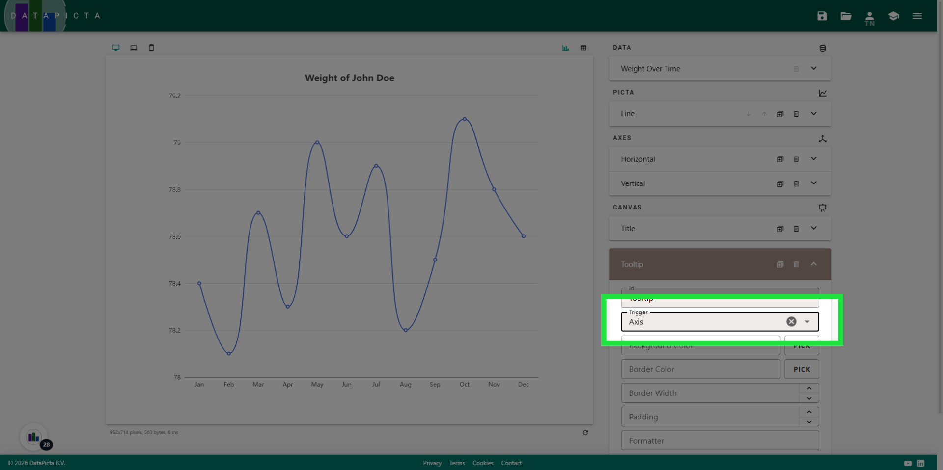
24. Change Tooltip Trigger
Change the tooltip trigger to "Axis". This adjustment will display a tooltip when hovering over the horizontal axis. Given that this line chart features only one line, we do not trigger on individual items, which are the dots in the chart, but instead on the axis.
25. Done
And that's it! You have created a smooth line chart complete with a title and a tooltip.