A Cool Heatmap
Learn how to create a cool heatmap using DataPicta.
Go to app.datapicta.com to open the DataPicta application.
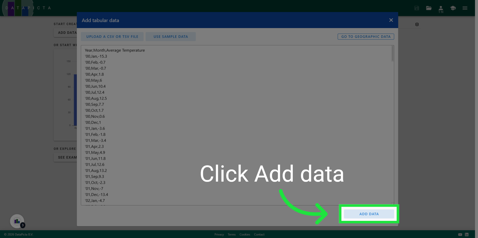
1. Add Data
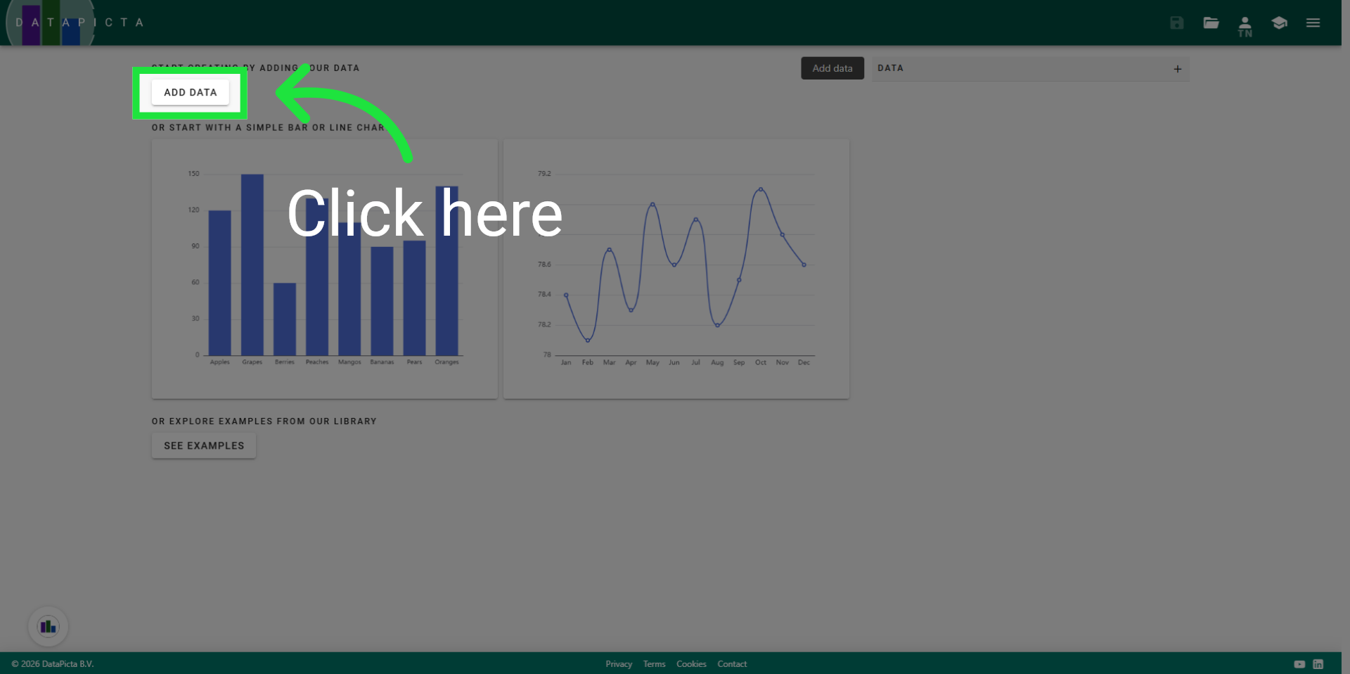
Every chart starts with a dataset. Click Add Data.
2. Use Sample Data Set
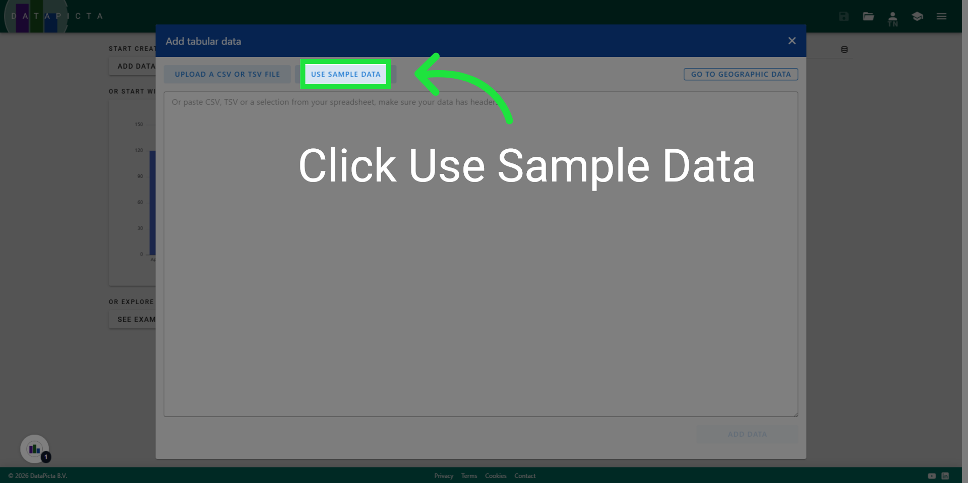
Fortunately, DataPicta already provides a useful dataset that we can utilize for a heatmap. Click on Use Sample Data.
3. Select Alaska Weather Data
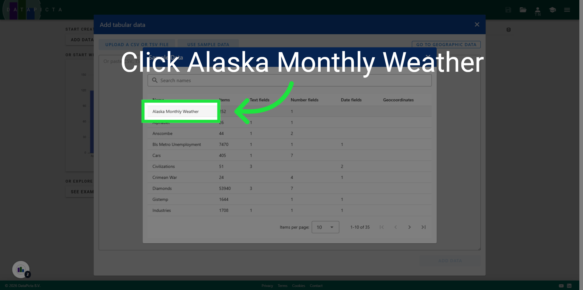
Click "Alaska Monthly Weather" to choose the specific dataset for this chart.
4. Add Data
Click "Add data" to include this dataset into your chart.
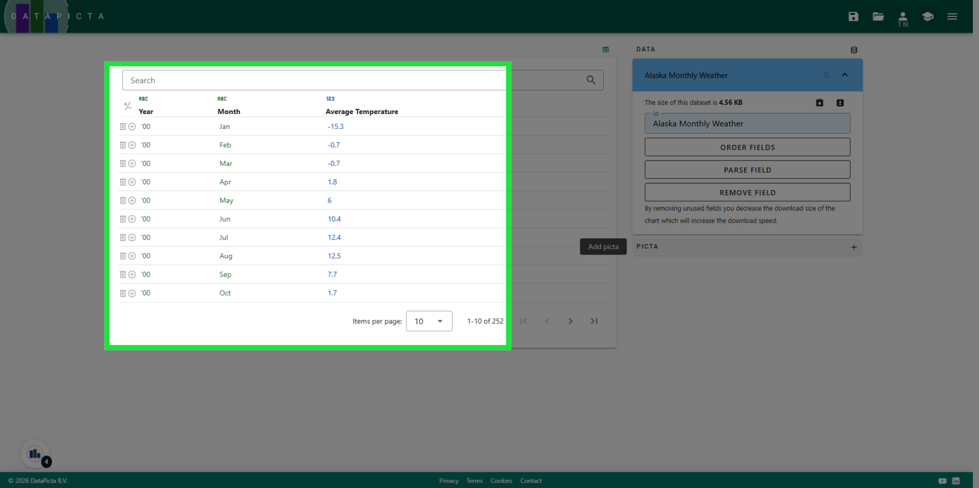
5. View Data
The data includes two text fields and one numeric field. This setup is precisely what a heatmap requires: the text fields will represent the X and Y axes, while the numeric field will be used to color the items in the heatmap.
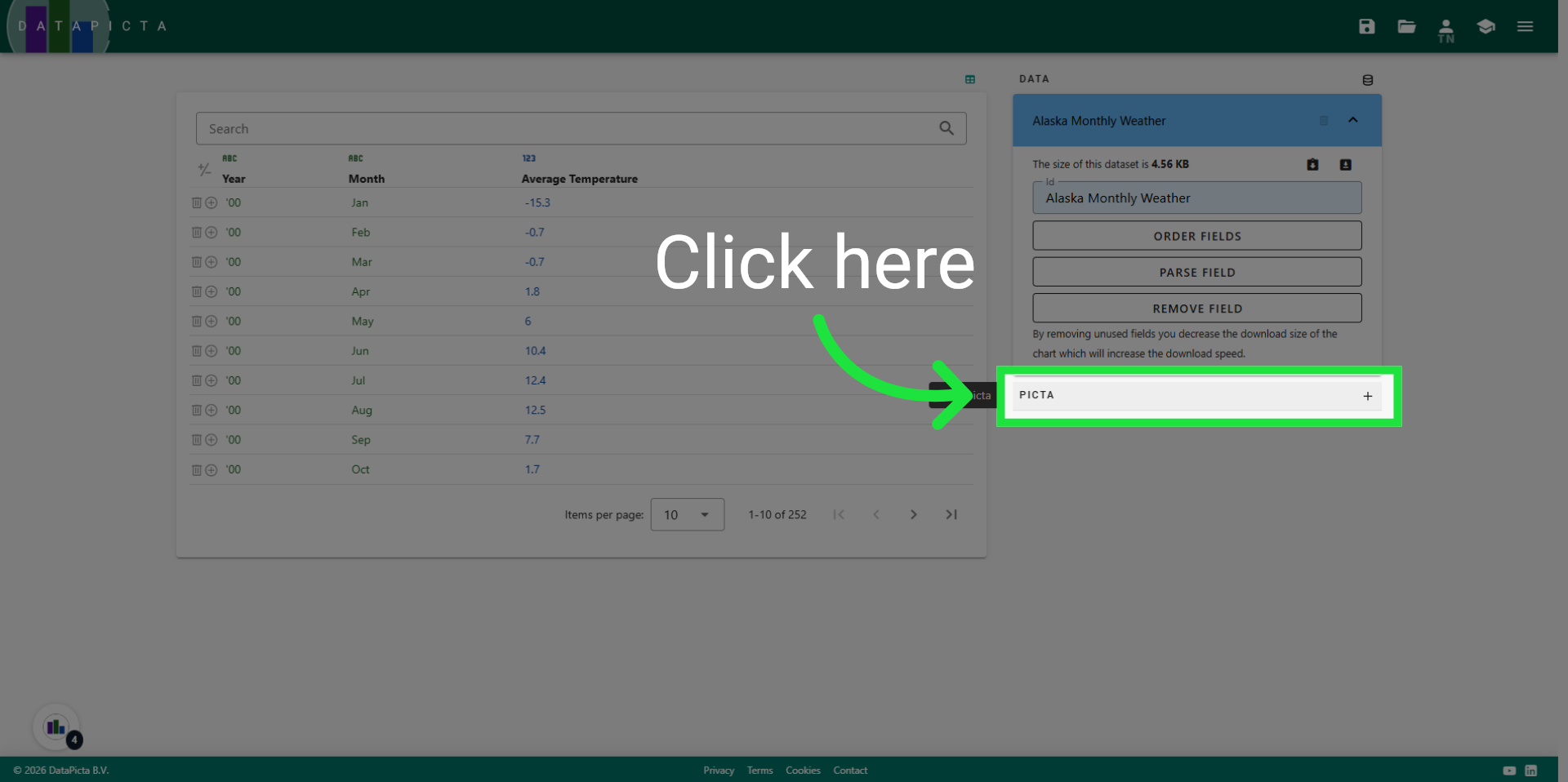
6. Add Picta
To add the heatmap picta, click on "Add Picta."
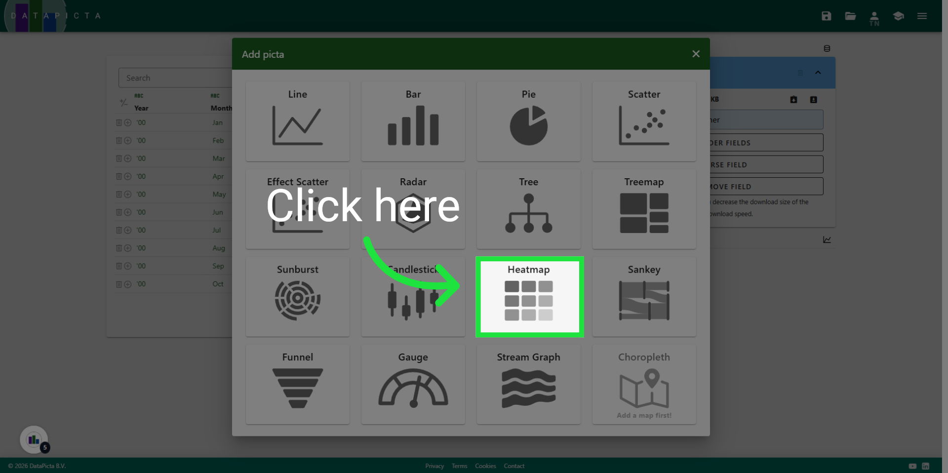
7. Choose Heatmap
Click on heatmap.
8. View Heatmap
A heatmap is generated from the dataset, automatically utilizing the text fields for the axes and the numerical field for the color representation. However, there is potential for enhancement.
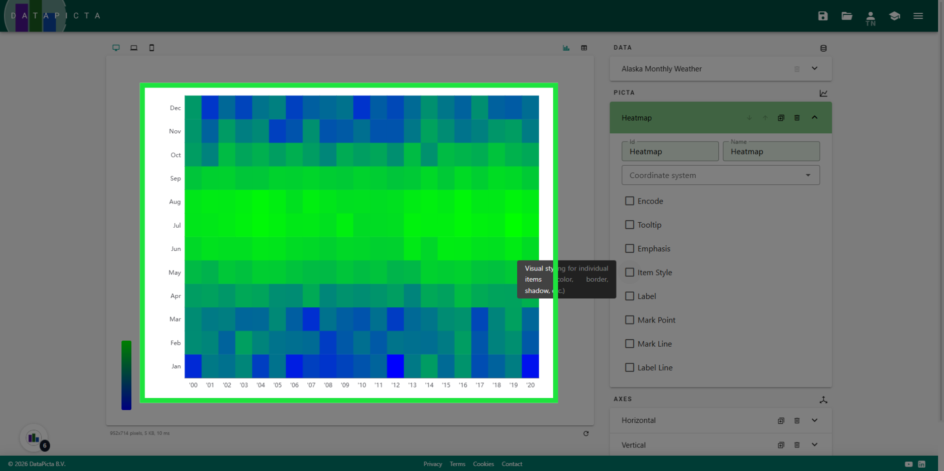
9. Enable Item Style
Let’s begin by modifying the items, that is each square in the heatmap. Click "Item Style" to enable changes to these items.
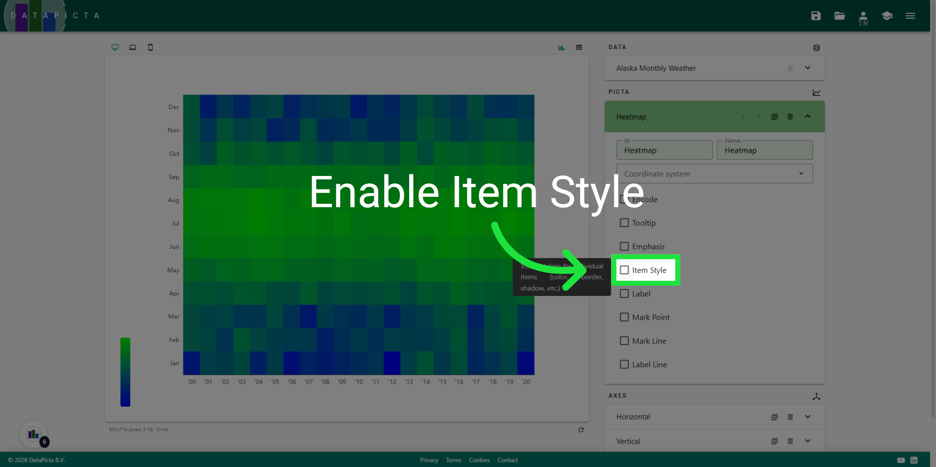
10. Set Border Color
To enhance the items, we will add a white border around them. Click "pick" next to the border color to open the color dialog.
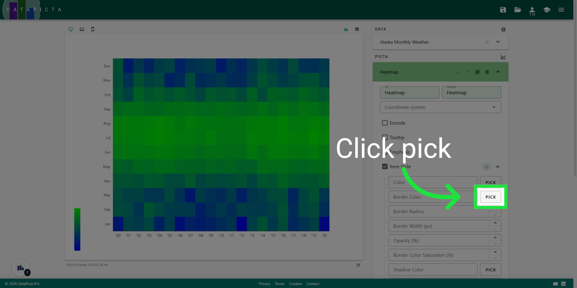
11. Select the White Color
Move the color picker to the upper left corner where the gradient is completely white, then click "Apply."
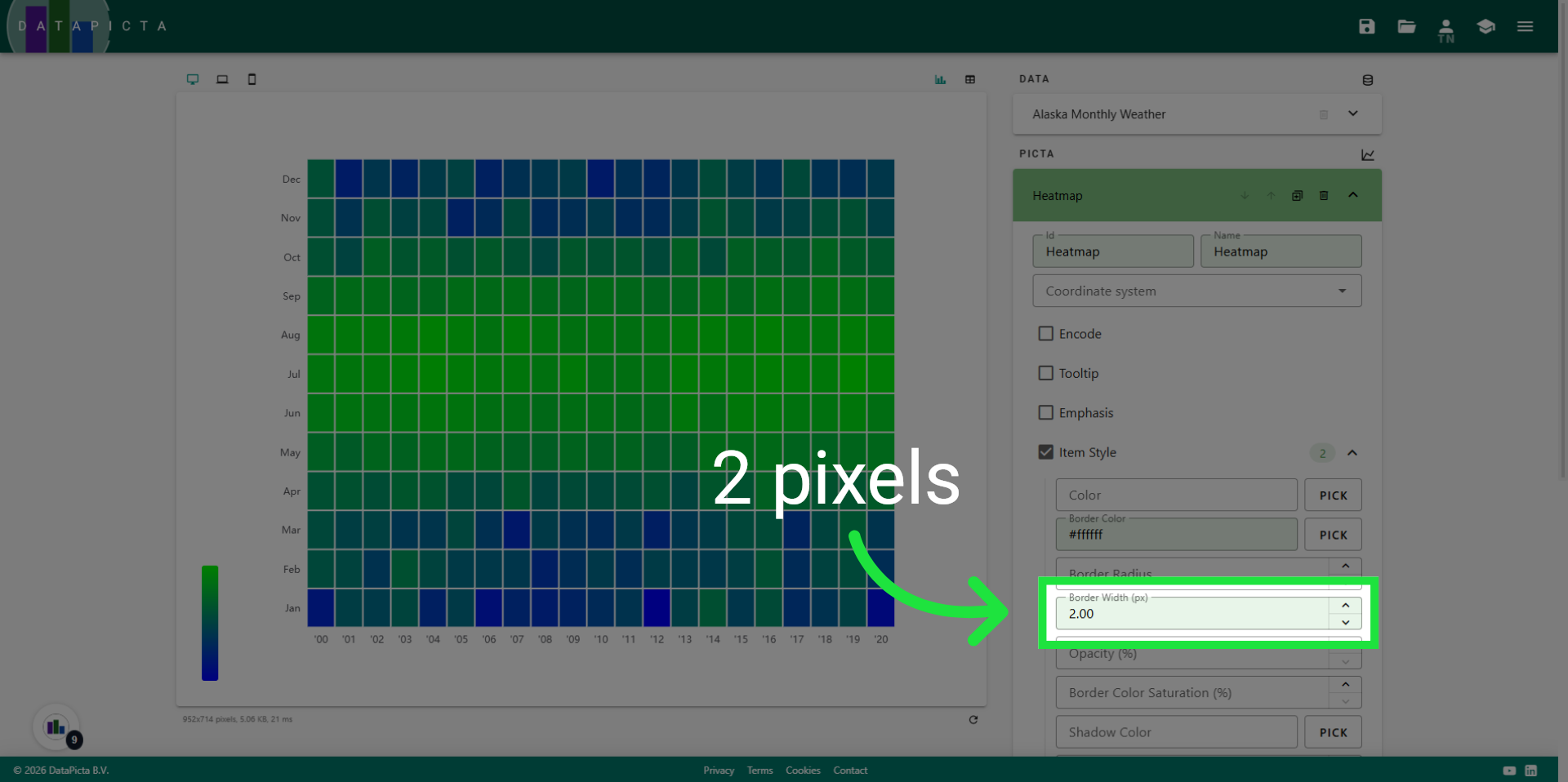
12. Set the Border Width
Set the border width to 2 pixels.
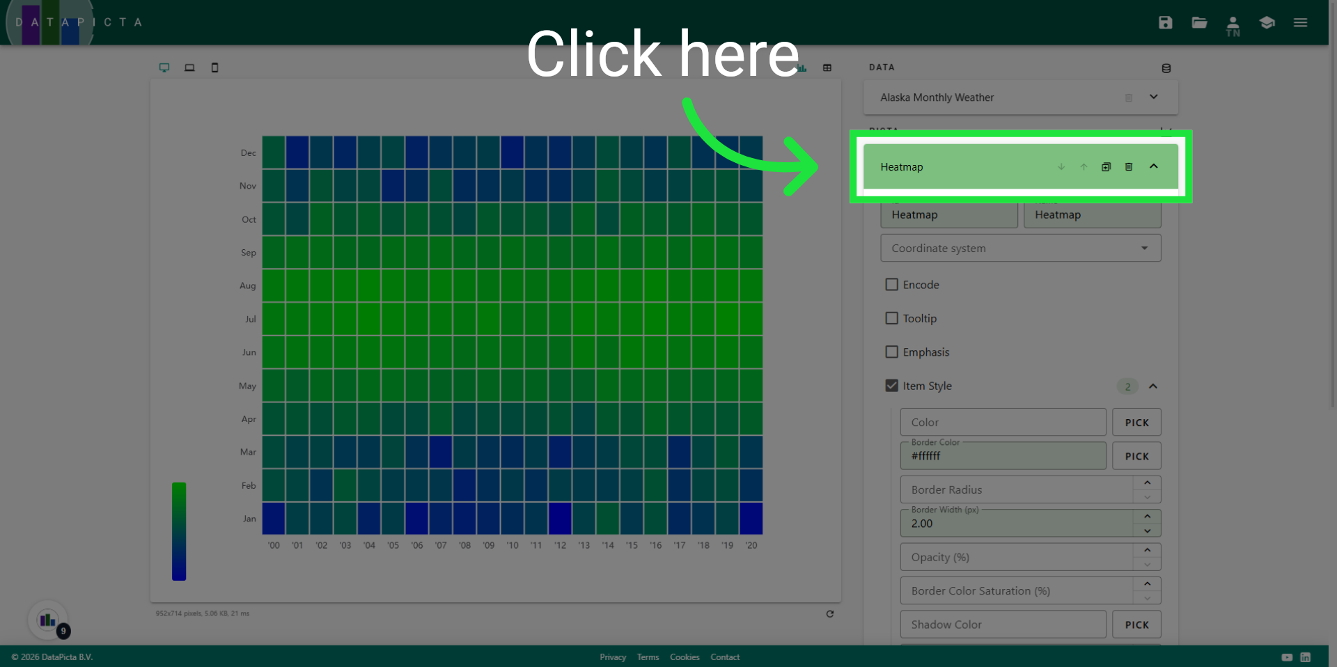
13. Close the Heatmap Panel
Now close the heatmap panel.
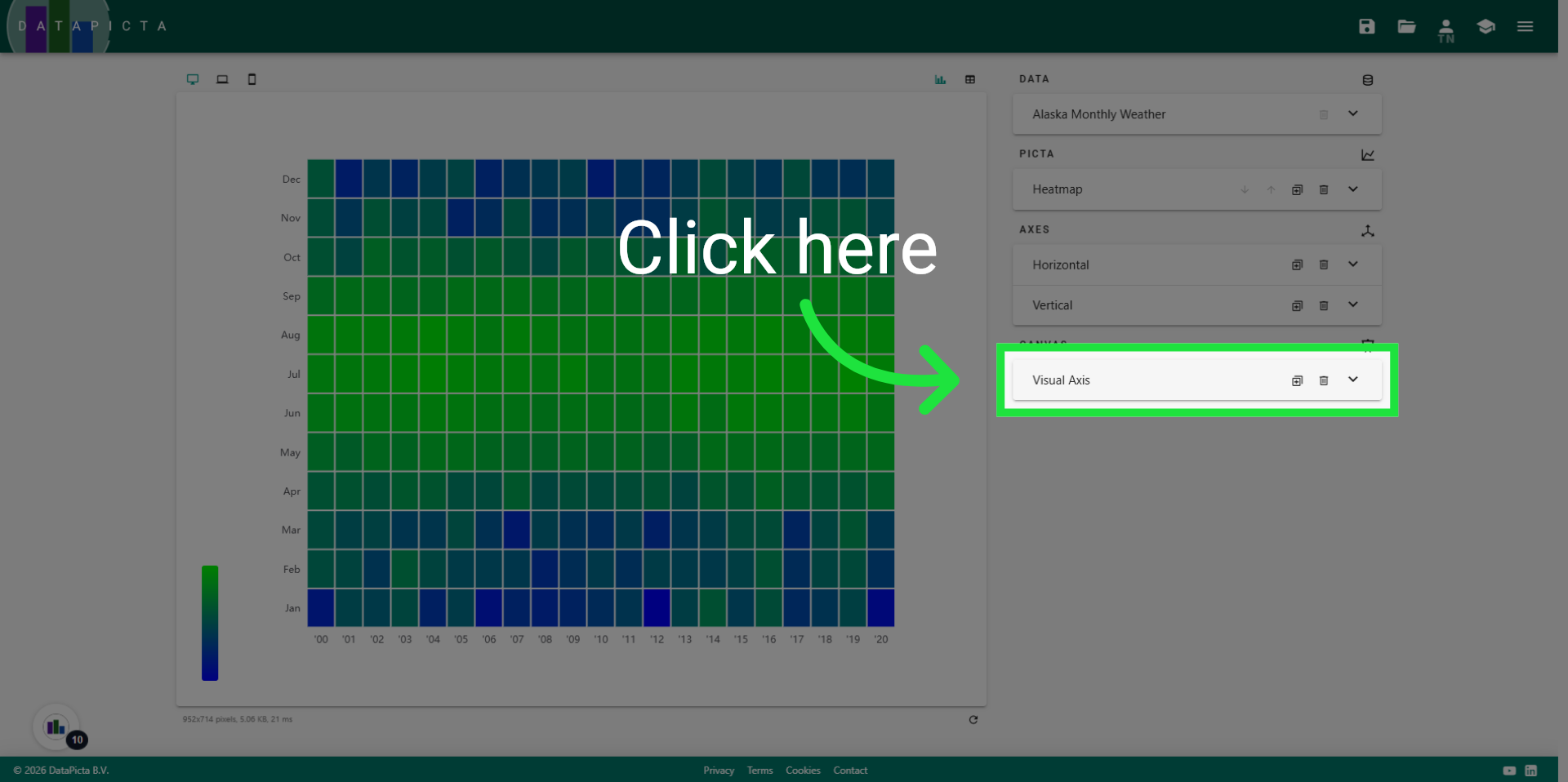
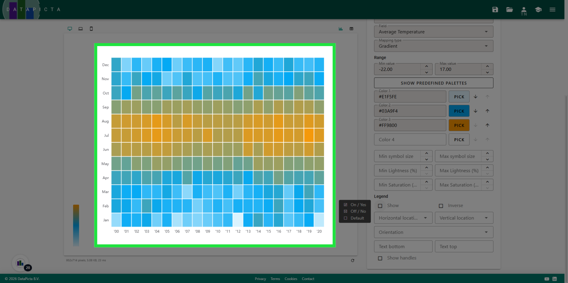
14. Open the Visual Axis Panel
Open the Visual Axis Panel. This Canvas element was automatically added when you included the Heatmap Picta, as a heatmap always utilizes color as a visual axis. However, the current colors do not accurately represent temperatures.
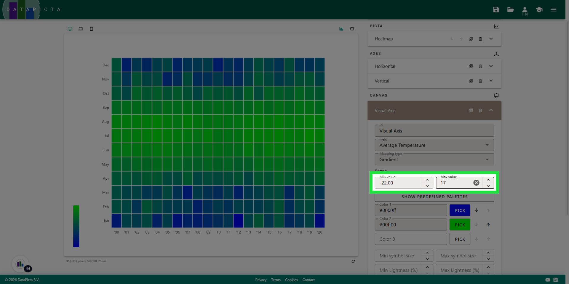
15. View Min and Max values
The minimum and maximum values are prefilled with the lowest and highest temperatures from the data. However, it is more logical to use integers in this context. Therefore, we will round down the minimum value and round up the maximum value.
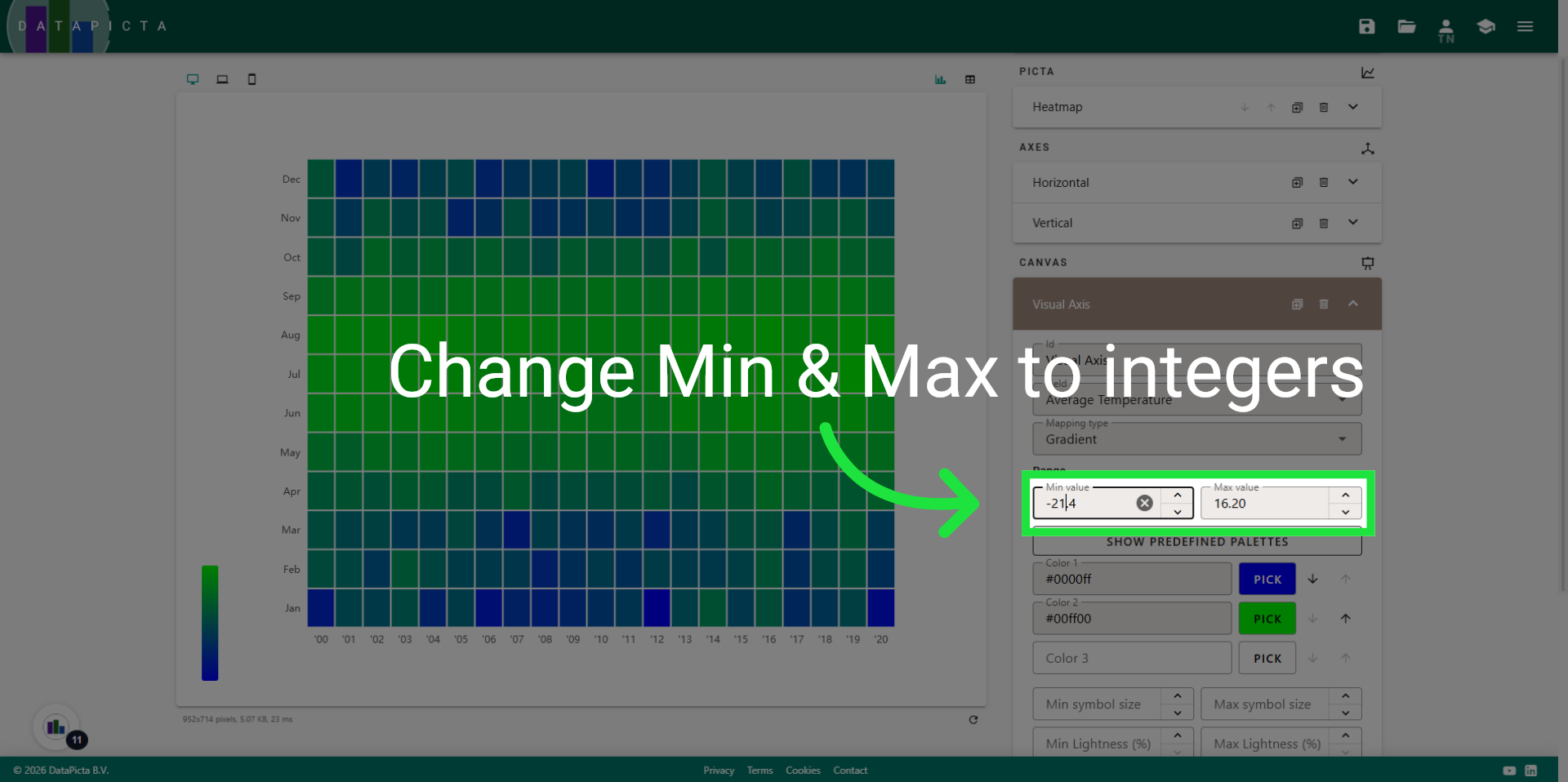
16. Set Min and Max values
Set the minimum to -22 degrees and the maximum to +17 degrees Celsius. While these measurements are taken in the USA, scientific temperature measurements are conducted in Celsius, not Fahrenheit.
17. View colors
Two colors are automatically set. A gradient between these colors is applied to the heatmap. Let's choose a light blue color for low temperatures and an orange color for warmer temperatures.
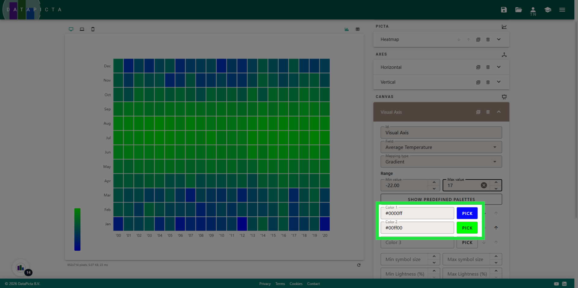
18. Set Colors
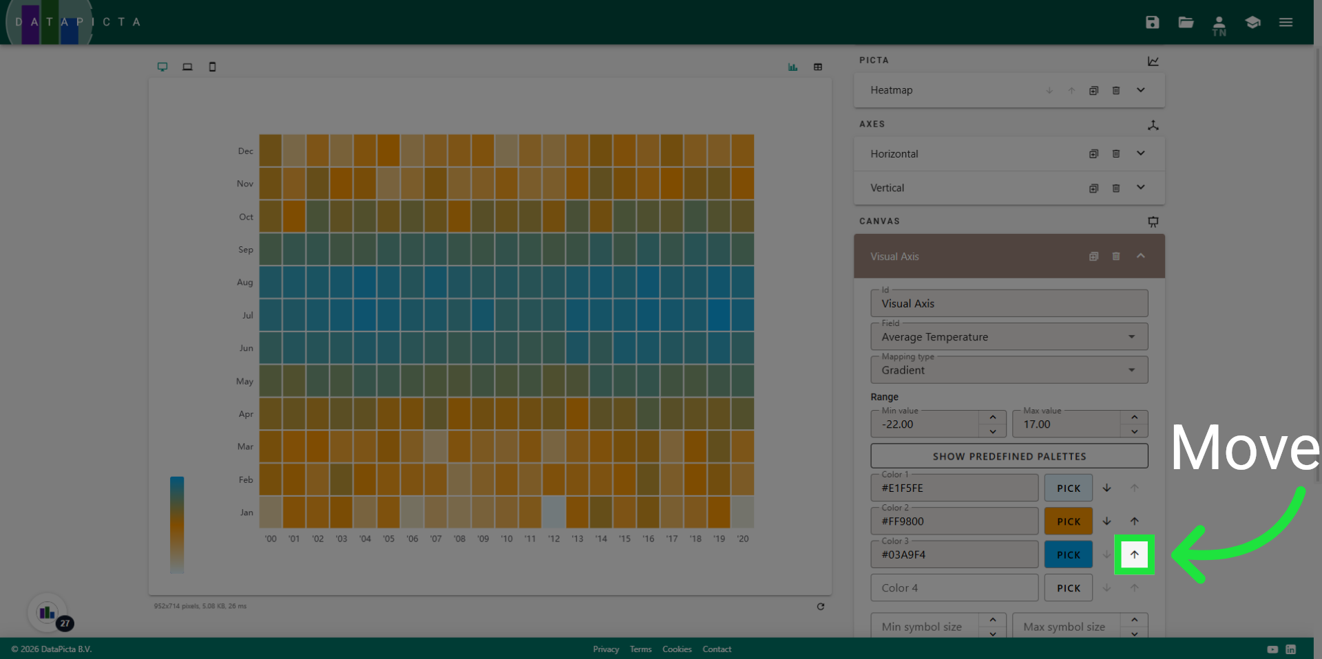
After selecting two colors, you may notice that the overall heatmap displays more orange than blue, which does not accurately reflect our intended outcome. In fact, you can assign more than two colors to create a gradient, so let's incorporate a darker blue shade to blend between these colors.
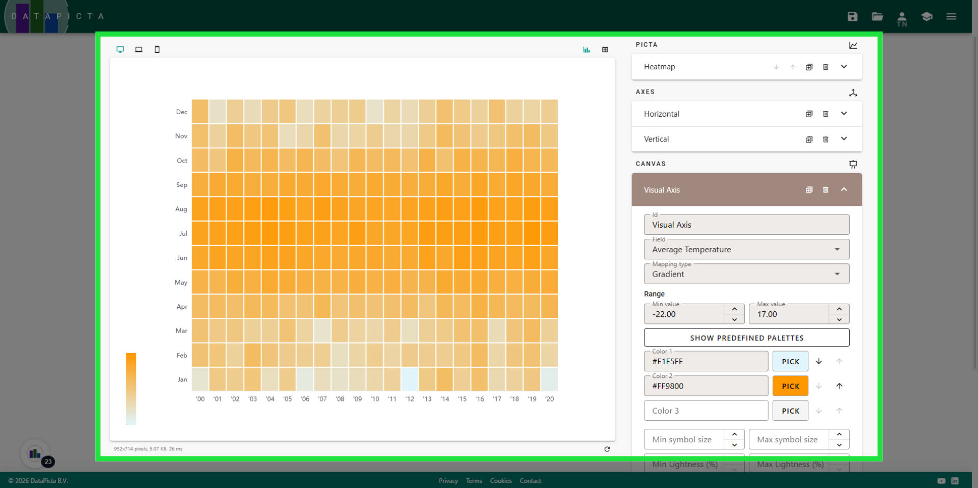
19. Order the colors
After adding a darker blue color, you should position it between the light blue and orange color.
20. View resulting colors
This is much better; it accurately represents the temperatures. Next we will customize the legend for this chart.
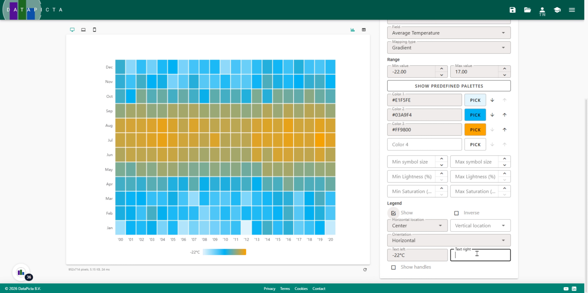
21. Improve the Legend
I personally prefer legends to be centered beneath the chart. For horizontal location, select 'Center', and for Orientation, choose 'Horizontal'.
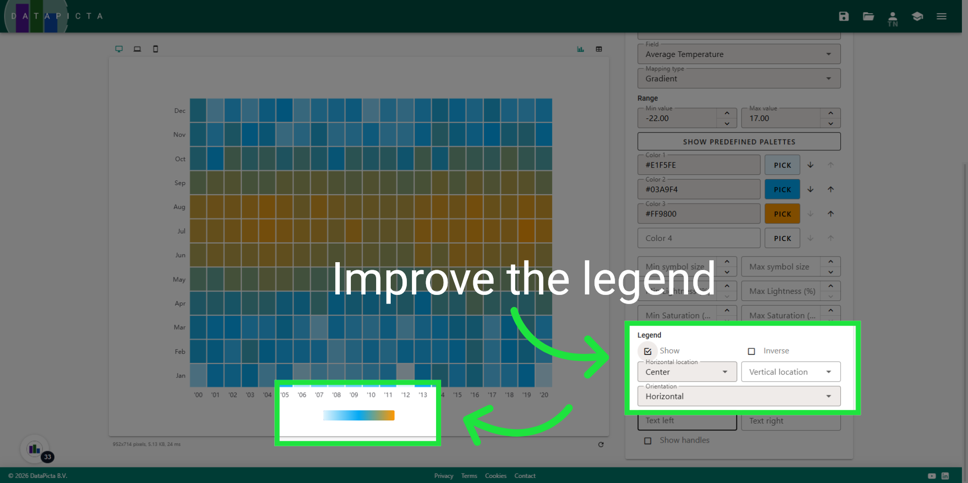
22. Enter legend text
To enhance the legend, you can add text on both the left and right sides. Enter -22 degrees for the left and +17 degrees Celsius for the right.
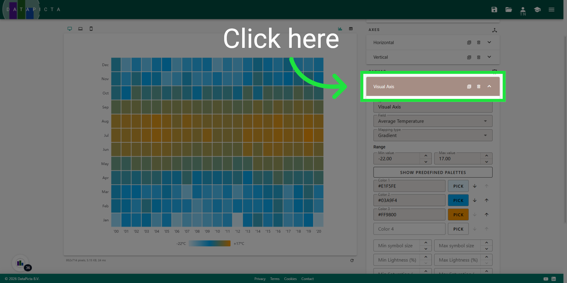
23. Close the panel
Now close the Visual Axis.
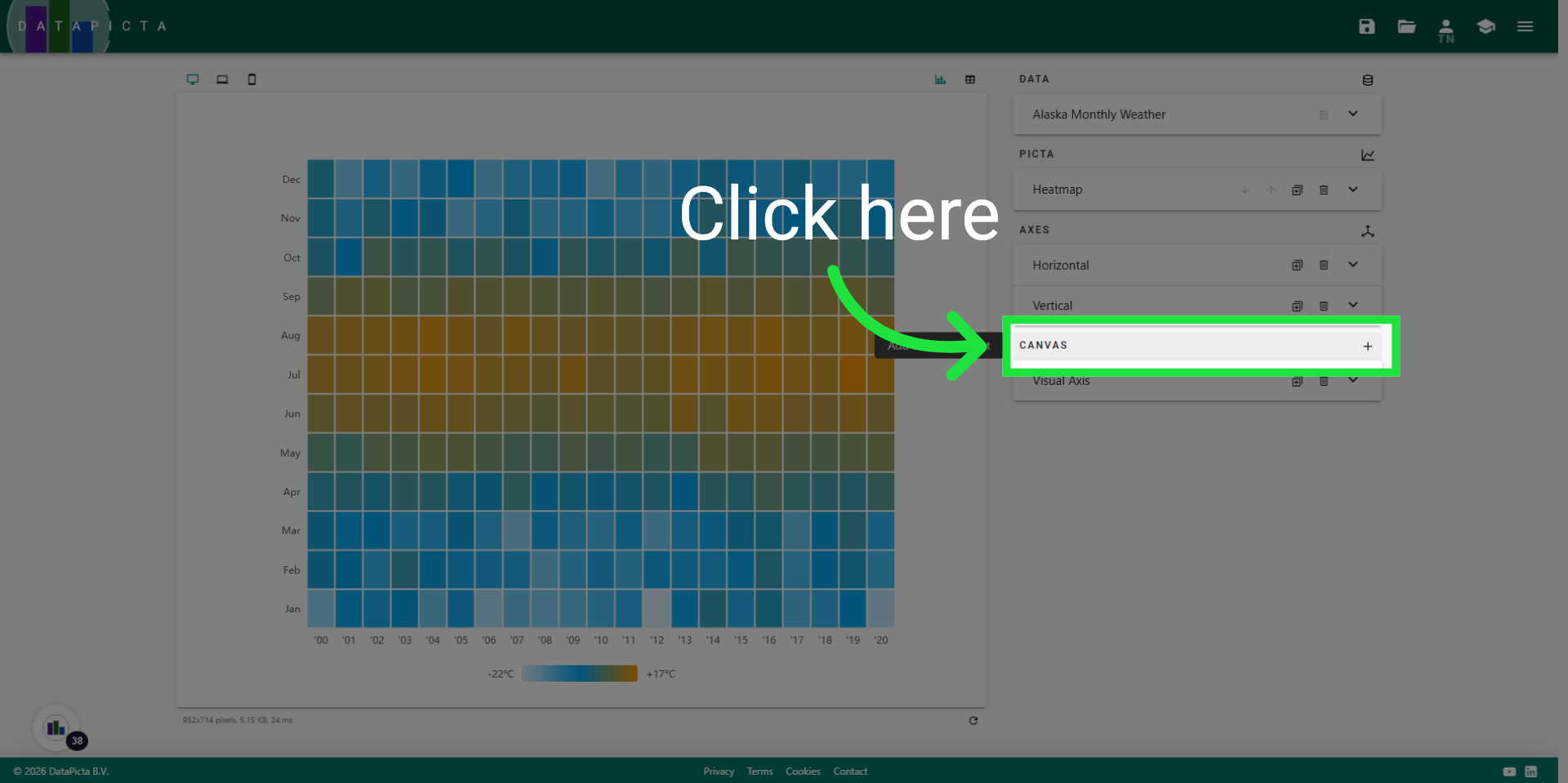
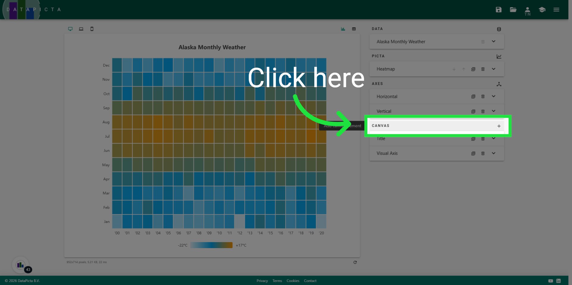
24. Add Canvas
Add a new canvas element.
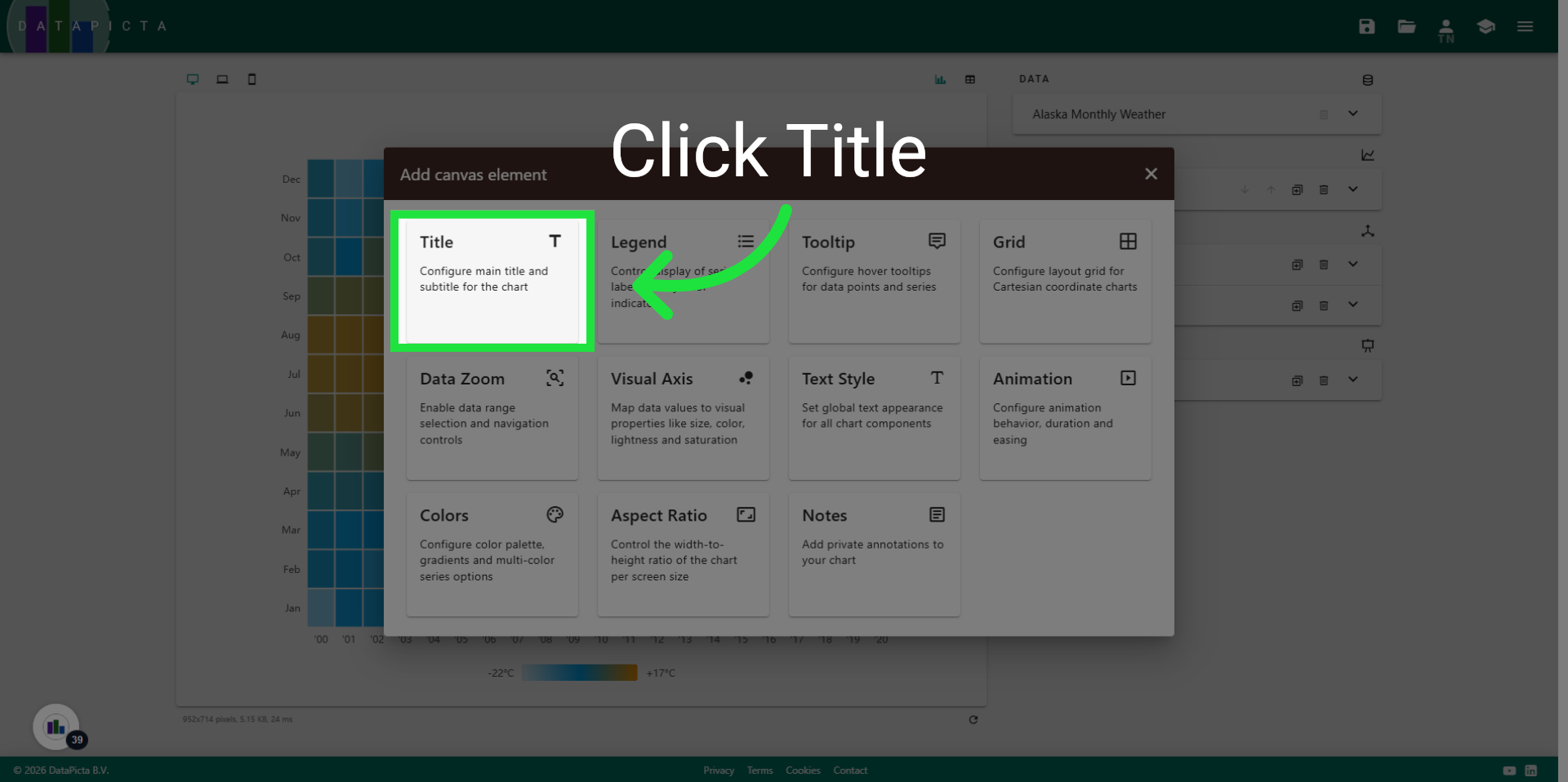
25. Select Title
And select title to add a title element to the chart.
26. Select Title Field
Click "Title" to edit the main chart title text.
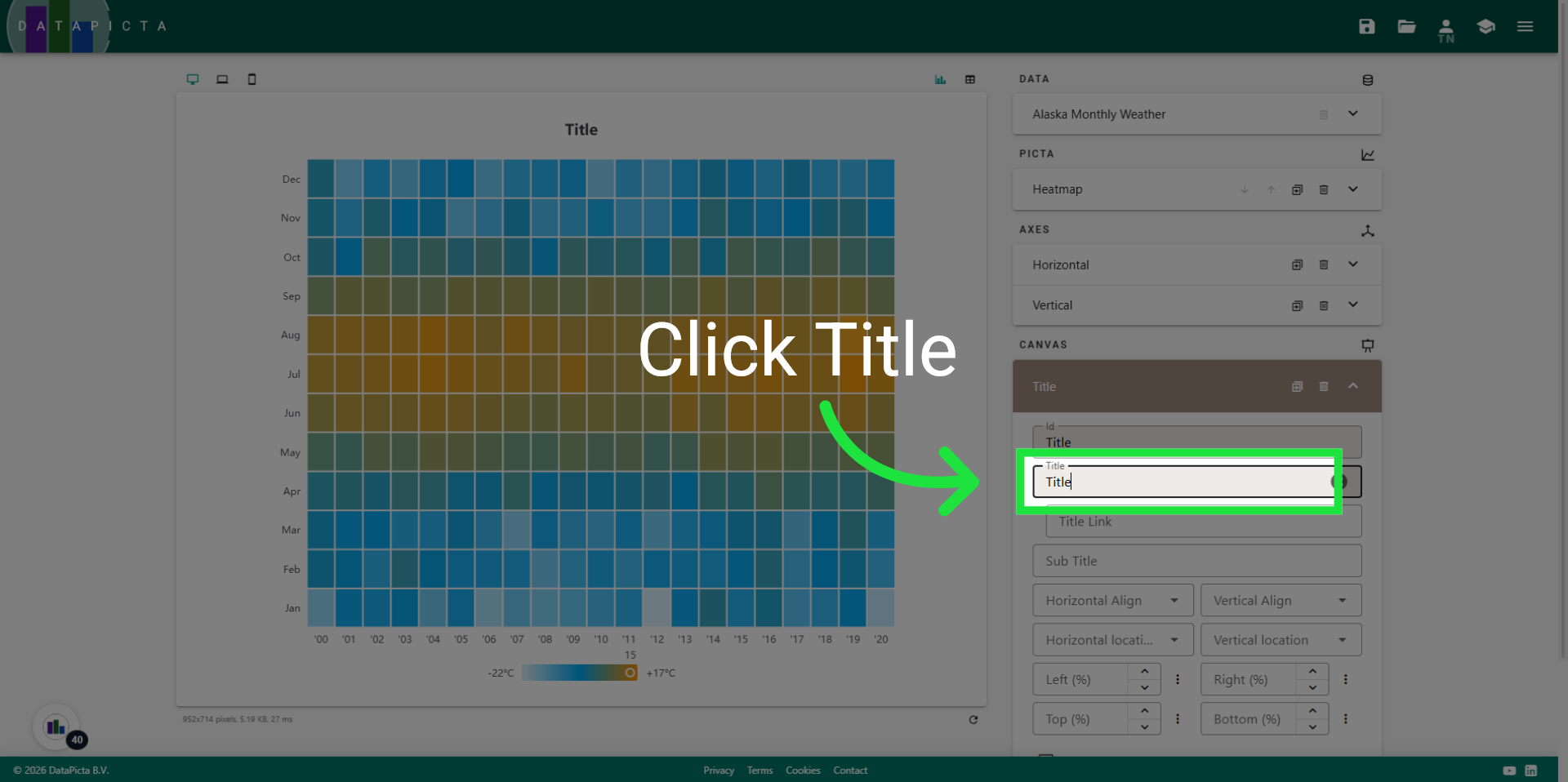
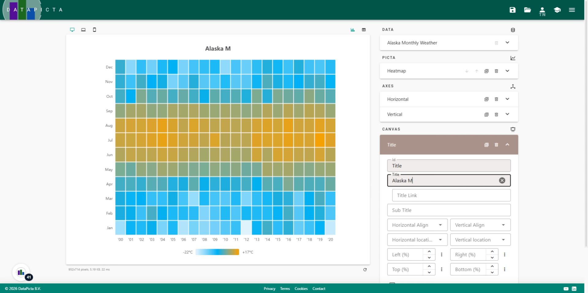
27. Enter Chart Title
Fill "Alaska Monthly Weather" as the main title of the chart, as these measurement were made in Alaska.
28. Add one more canvas element
Now, add one more canvas element.
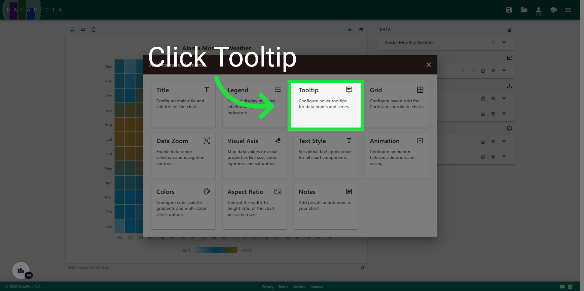
29. Select Tooltip
Select the Tooltip this time.
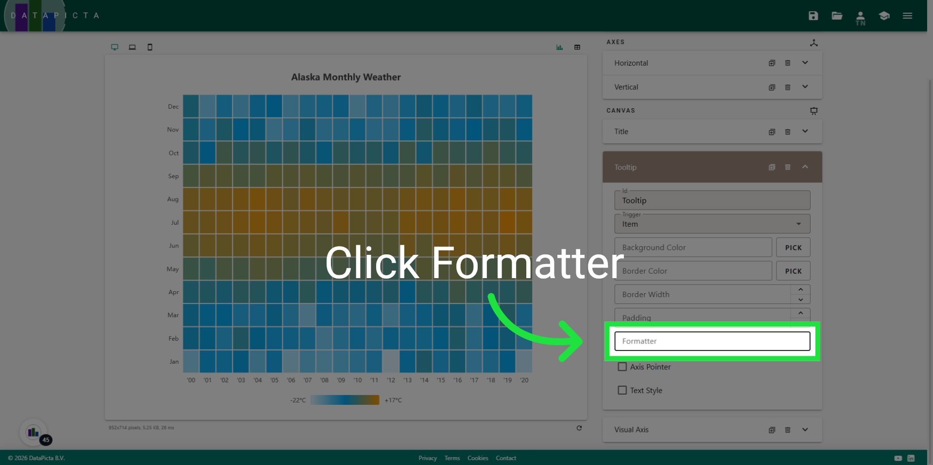
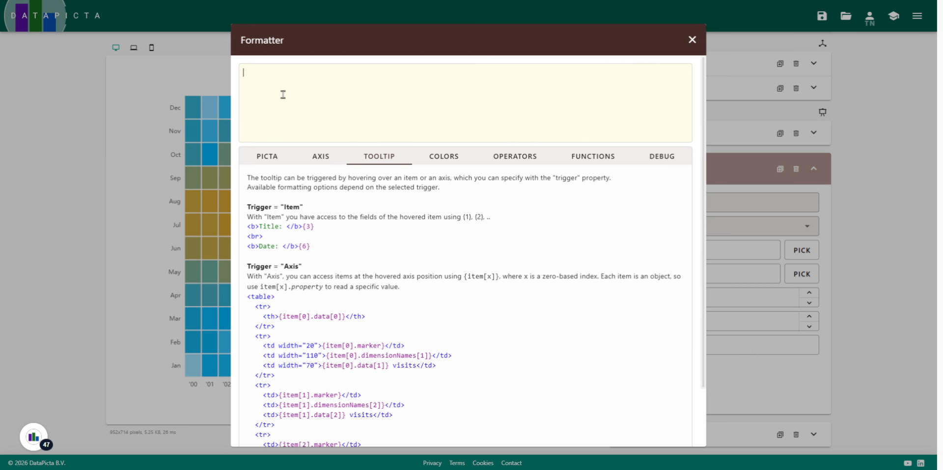
30. Click Compose Text
The tooltip is now functional; however, we would like the text within the tooltip to show a different message than the default. To achieve this, click on Compose Text.
31. Open Compose Text Editor
Click here to open the compose text editor for tooltip customization.
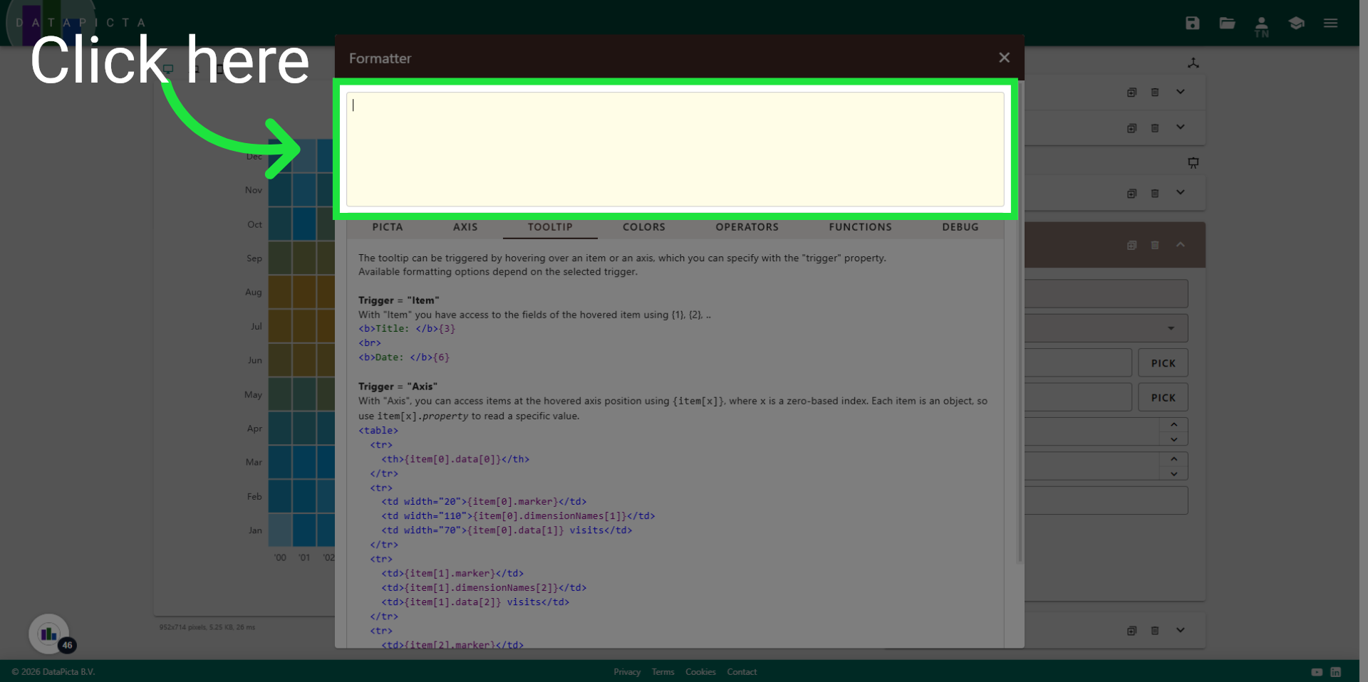
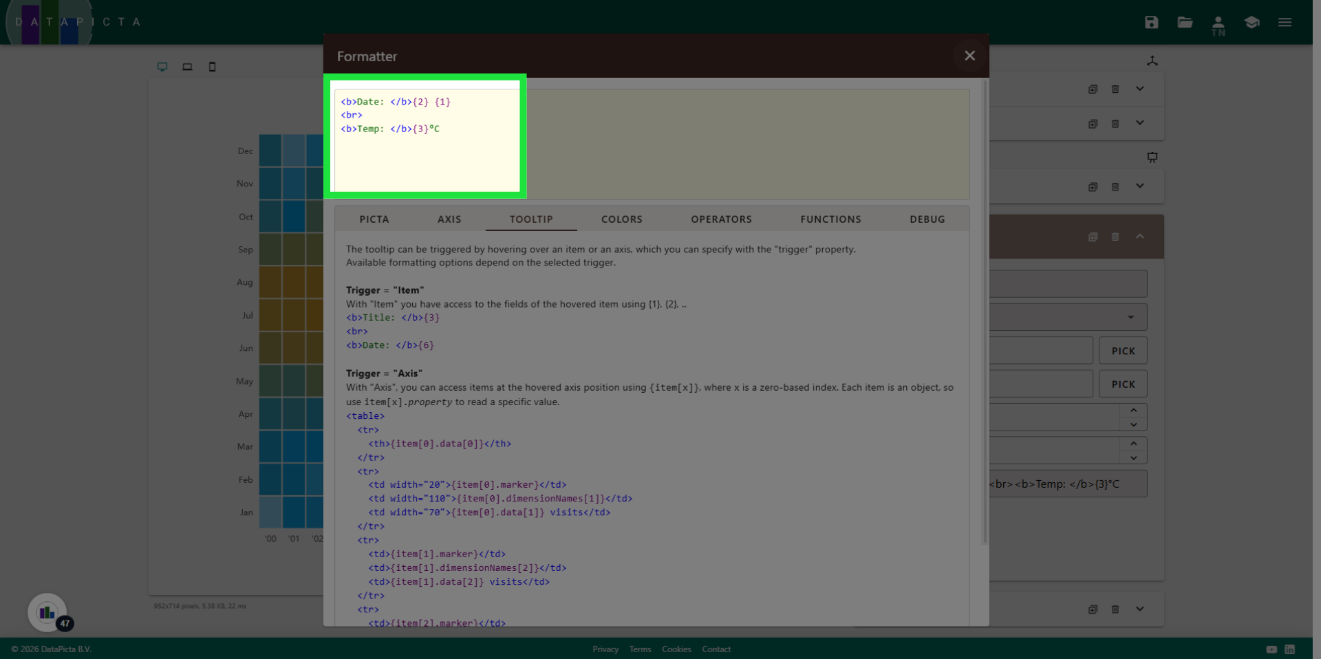
32. Format the tooltip text
The text we will enter here is actual HTML code and resembles the first example written below. You may pause the video or copy and paste the text from the description below.
33. Save Tooltip Settings
This HTML code will display two lines in the tooltip. The first line will be the data from the first and second field, which is the Month followed by the Year. After the break element, the second line follows, showing the third field, which is the average temperature for that month.
34. Save Tooltip Settings
Now close the Compose Text dialog.
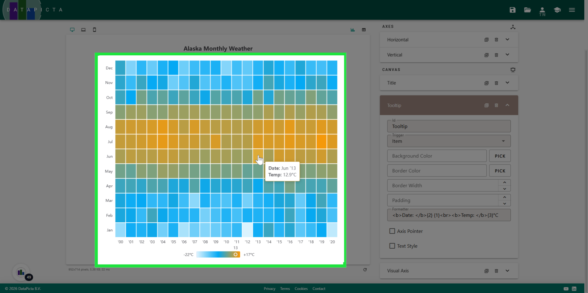
35. View Tooltip
Now hover over the chart to see the result.
36. Add Canvas Element
We will add one final canvas element.

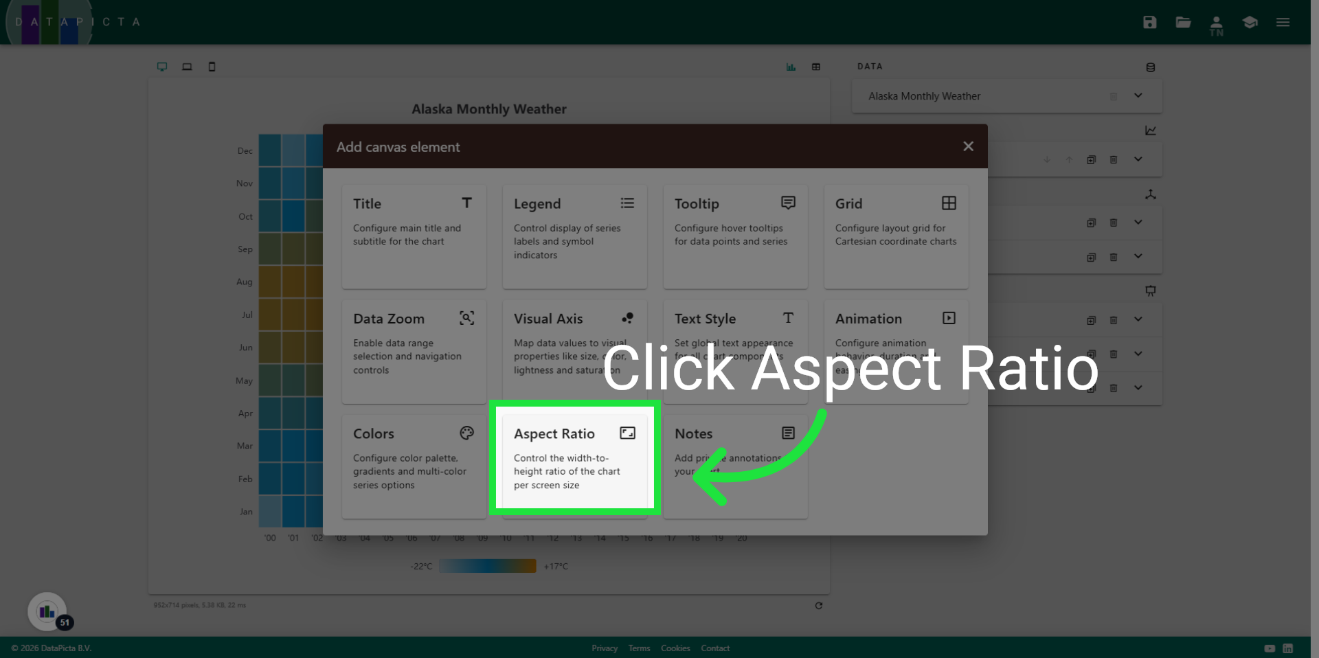
37. Pick Chart Ratio
Click the Aspect Ratio element.
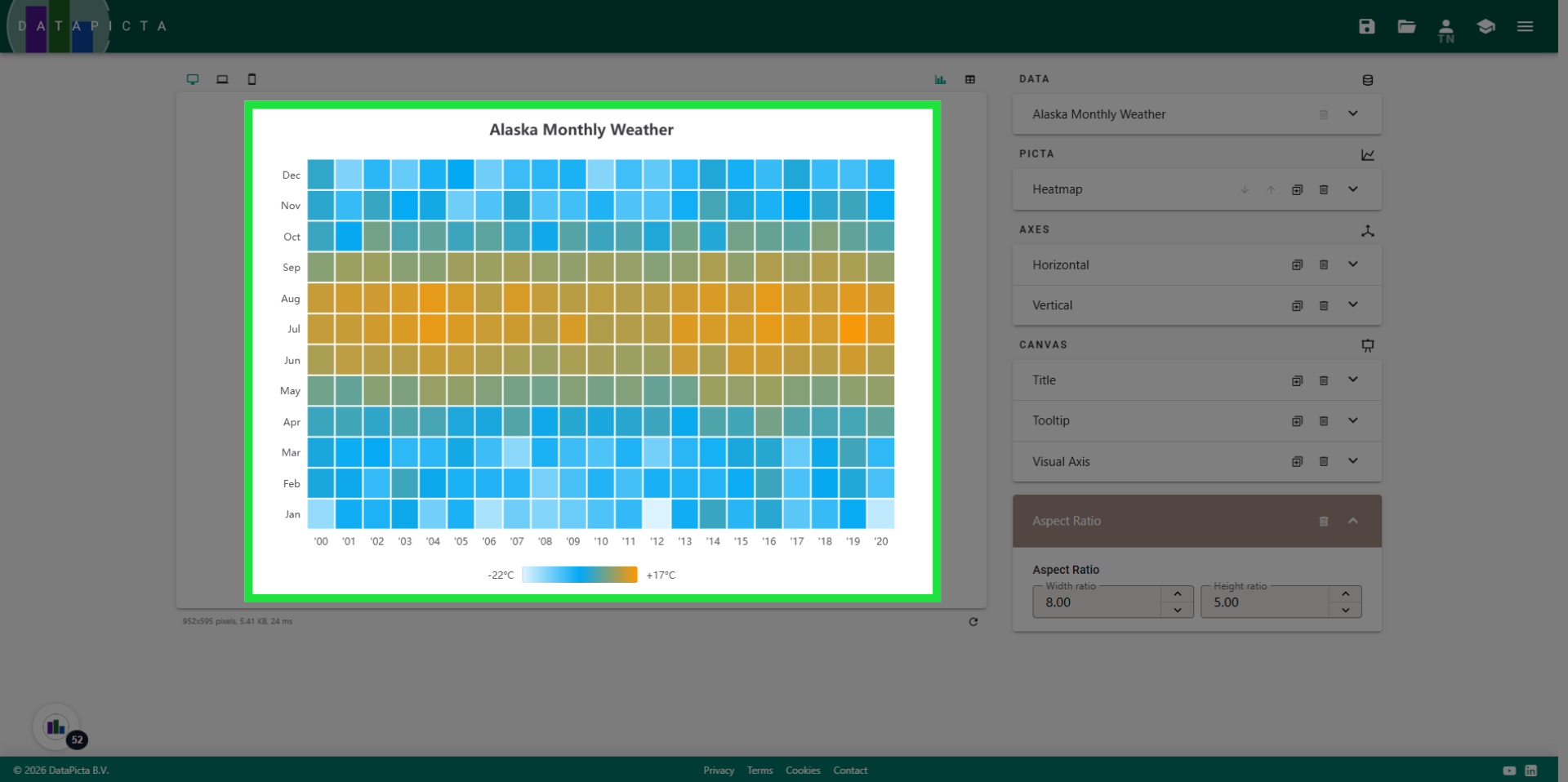
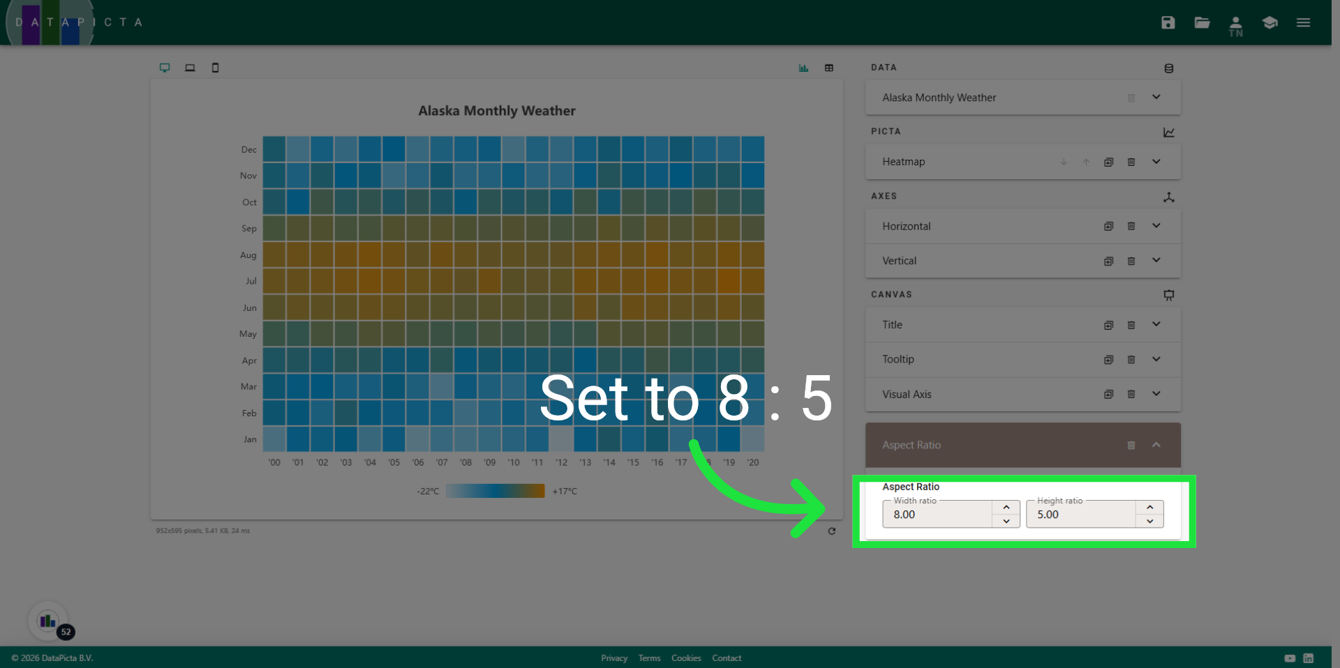
38. Set Aspect Ratio
To make the items appear more like a square, we will adjust the aspect ratio to 8 by 5.
39. Enjoy
You created a beautiful heatmap; you should be proud.